Showing posts with label Contextual Reference. Show all posts
Showing posts with label Contextual Reference. Show all posts
Thursday, 21 April 2016
Sunday, 17 April 2016
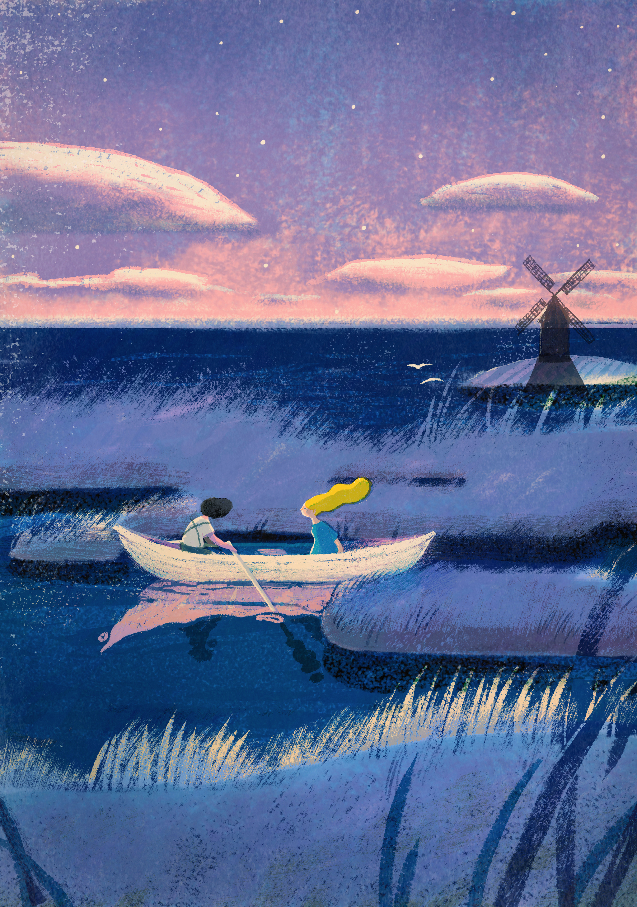
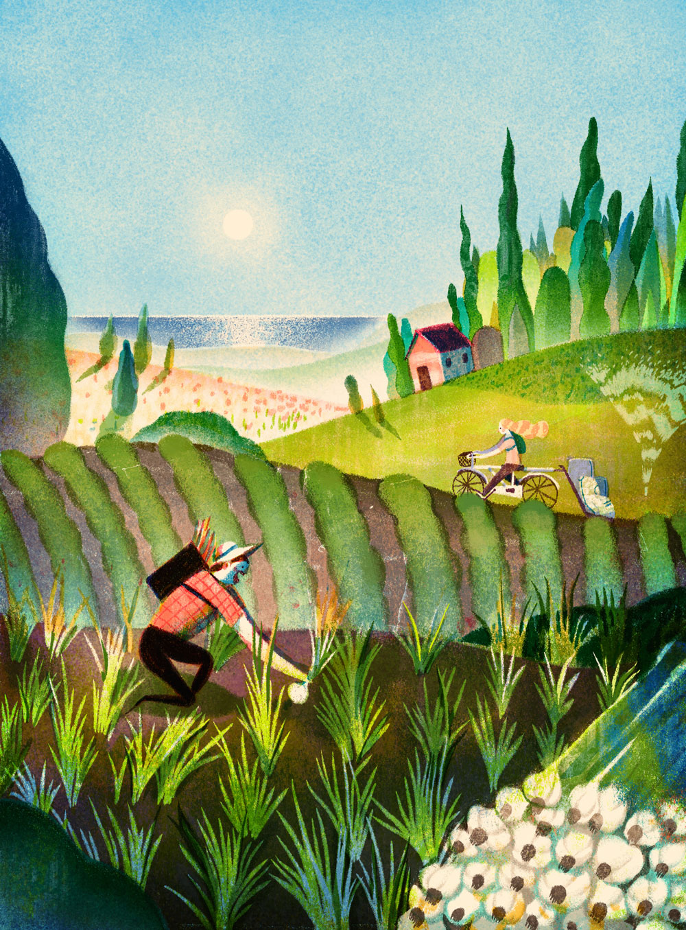
Lisk Feng
Lisk Feng is one of my favourites at the minute, and for a while now.
She's great, great colours, composition, clarity, charm. She's got it all
I can't figure out her process
It looks like a digital traditional hybrid
Or maybe she's just really good at either one
I really can't tell
Her practise is quite varied, she seems to work commercially for editorial and advertising but also has done comics and has personal work that seems to feed into her commercial projects.
It's basically the career I want, editorial and advertising for money, comics, books and personal work for fun and sanity.
Here are some favourites
Pink and blue, classic.
The yellow really POPs out too
Great clouds
Textures, what are they, natural or digital
How did she doooo this
I think, on closer inspection it might be digital painting, textured brushes.
So anyway I emailed her today
This is said email

Hallmark research
I never really considered greetings cards and whatnot as part of my practice.
Not that I don't think I would do it, I've just never actively done it, other than cards I've made for family and friends birthdays and weddings and stuff.
I also am realising I know little to nothing about card trends and whats going on in that industry at all
I never even buy greetings cards because I make them
But the ones I make are either horrible through request, or very specialist to the person I'm making it for.
So I'm doing some research
Tigerprint and Hallmark seem to have murged
Here's some of Tigerprints offerings through M&S


Follow Hollie's board Greetings Cards on Pinterest.
Not that I don't think I would do it, I've just never actively done it, other than cards I've made for family and friends birthdays and weddings and stuff.
I also am realising I know little to nothing about card trends and whats going on in that industry at all
I never even buy greetings cards because I make them
But the ones I make are either horrible through request, or very specialist to the person I'm making it for.
So I'm doing some research
Tigerprint and Hallmark seem to have murged
Here's some of Tigerprints offerings through M&S
Yep this is nifty for mainstream humour
I'm on board
This ones quite nice
Quite twee
I guess a lot of cards are twee
I can probably do twee
Maybe
This is pretty
I'm not great at flowers though
Flowers seem to be a strong motif throughout
Obviously
This ones a really lovely drawing tainted by the record wheels gimic.
What is the relevance of the record wheels
They just distract unnecessarily from the charm of that ink line
I've made a pinterest board of the kinda stuff going on on pinterest
The beating heart of twee craft illustration
It looks like I'm gonna have to practice my naive hand-drawn type
Follow Hollie's board Greetings Cards on Pinterest.
Sarah Benning
This lady has got it sussed
She makes illustrative embroideries of plants
They're really lovely and sell for a buttload of money

She makes illustrative embroideries of plants
They're really lovely and sell for a buttload of money

Apparently it takes a very very long time, which warrants the high price
I wonder what this equates to as an hourly rate
i mean I'd like to try this but I don't think I have the patience
Wednesday, 13 April 2016
Brusha brusha brusha
Y'know that bit in grease where Jan does that brusha brusha thing
 That bit
Well I watched the advert cos I was on this website
http://thecartoonguru.blogspot.co.uk/2011/03/well-be-right-back-part-3.html
And it's really great
Really good 50's space future aesthetic and great character movements
Turns out he was actually a Disney character designed by Tom Oreb, one of the cartoonists responsible for the cartoon moderne style.
Here's some of his work.
It's really just excellent.
Like a how-to guide in character design
So much movement in static imagery
GREAAAT legs
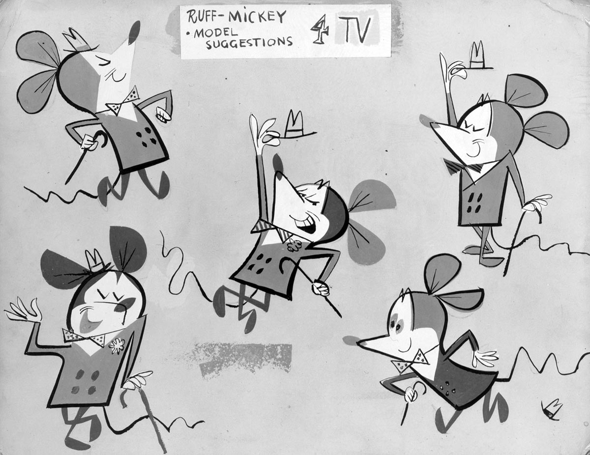
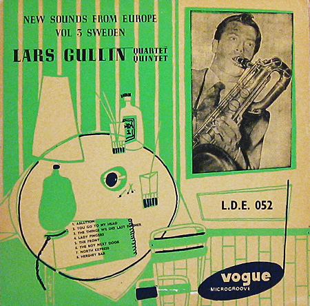
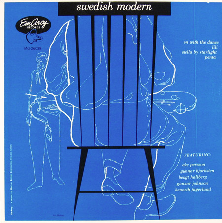
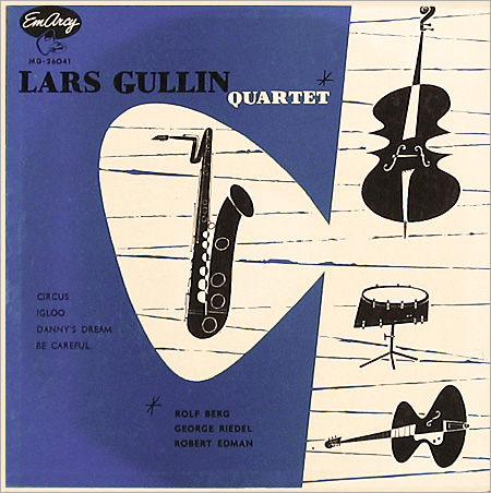
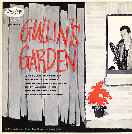
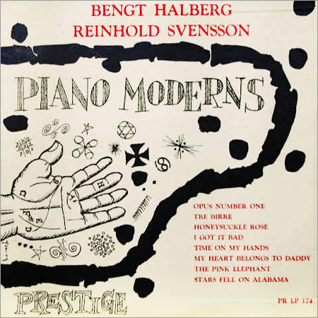
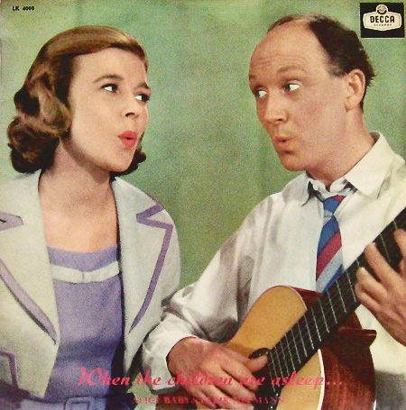
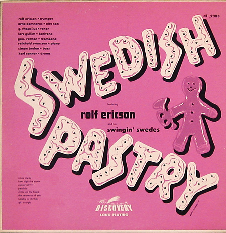
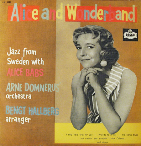
Swedish 50's jazz album covers
Found this blog roll of rare swedish jazz ablum covers from the 50's
I mean I'm already pretty into jazz album covers from the 50's generally and like Jim flora and such but these are reeeally great
http://www.birkajazz.com/archive/sweden_2.htm
Some faves
I mean I'm already pretty into jazz album covers from the 50's generally and like Jim flora and such but these are reeeally great
http://www.birkajazz.com/archive/sweden_2.htm
Some faves
Friday, 1 April 2016
Matt Forsythe
Everything he does is great
He has a very distinctive palette at the moment, very evocative of forrest woodland fantasy swamp vibes
He's basically had a dream career, starting with Drawn and Quarterly publishing his books, winning a thousand awards, working with Cartoon Network on Adventure Time, not to mention his numerous other massive clients like The New York Times and Dreamworks and Netflix.
So well done him
Here's some images I enjoy
Wednesday, 30 March 2016
Anomalisa

Went to see anomalisa at Hyde park, Adam got free tickets from this quiz about sustainability we went to so he can mingle with the union and become president. Turns out just us and one other girl showed up so we did a casual version of the quiz and won the tickets.
So the movie. Charlie Kauffman and duke Johnson working in mesmerising stop motion to tell the introverted story of mentally unstable narcissistic guru of customer services Michael Stone taking an inane business trip that ends up pushing him over the edge.
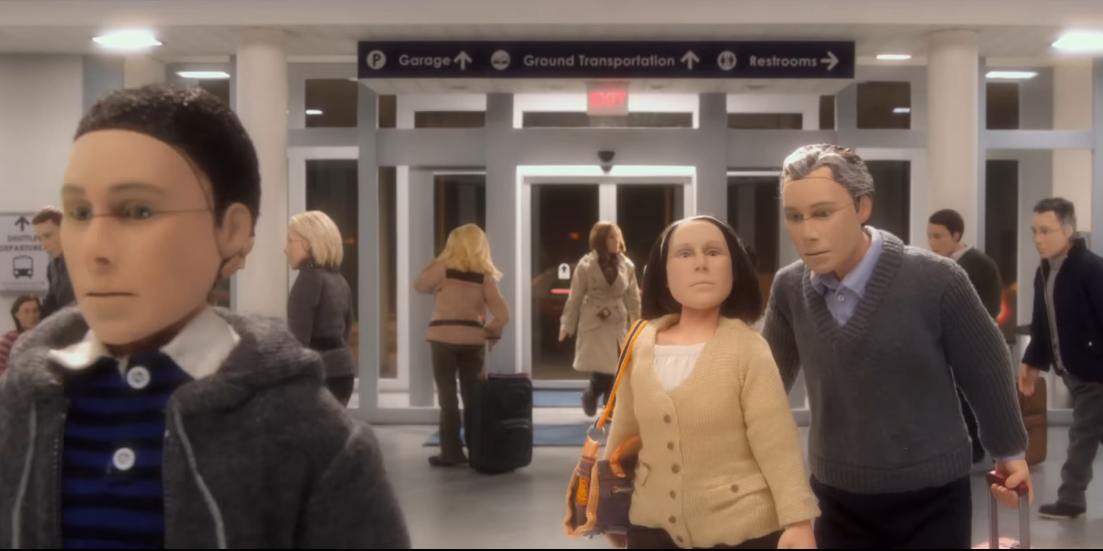
I enjoyed it a lot. It was horribly unpleasant to watch for the most part, which is quite a feat to acheive. The main reason for this is that everyone except Michael has the same crash text dummy face and the same unsettlingly neutral voice. This is his disorder, called fregoli, where one perceives everyone in the world to be the same person. Pretty freaky stuff. So obviously he's pretty miserable and completely isolated in this perceived world of empty clones and this gives him a lot of desperation and intensity. Quite an unlikable guy really, and i do love an unlikeable protaganist.
There's an unsettling level of intimacy throughout the whole thing right from the benginning when Michael shuffles restlessly around his hotel room drinking chain smoking and practising embarrasingly what to say to a woman he abandoned ten years ago. This continues as we watch him stammer destructively through drinks with said woman, who he clearly destroyed. Here one begins to feel less sympathetic and more guilty as if he reflects the worst case scenario in all of our characters. I mean maybe if I started seeing everyone I loved as a vapid replica of everyone I hated with no ability to differentiate between them, maybe I'd end up abandonning and ignoring said people with little care for the consequences. It's not like he can even hear the sadness in their voices.
I'll note at this point that one of my favourite bits was when he turned the big tv on, I think it's meant to be early 2000's but it makes that static fizz noise that id forgotten about. What attention to detail and faith to the time frame does that demonstrate on the part of the sound people. Greatttt stuff.

So then he hears this voice, and we hear it like he does cos we also have been heading incessant Tom Noonan. It's a happy lady voice and he's like woaaaah who is this and goes crazy knocking doors to find her and he does and she looks different too and he's slated. They go for drinks with her friend, they've come to see the seminar on customer service he's giving and are kinda can girls. Emily, the friend, we're told repeatedly is more attractive and popular with men, but since we see her as another androgynous crash dummy we, like Michael, dismiss her in favour of Lisa and her proper human face.
Then after awkward drinks he takes her back to his room and pursues her despite initial her reluctance. He gets her to sing for him, I guess singers probably all have that same voice, so thats a nice little moment. Then begins the most excruciating sex scene in the history of film, television, or really any visual media, to my knowledge. I'm uncomfortable jsut remembering it, it really must be seen to be believed, and I'm certain I will never forget the experience of watching two soft puppets have hyper-realistic, unnappealing and unglamouros intercourse on a cinema screen with a room full of equally baffled strangers.
After this he finally goes to do the conference in the midst of which he has an excellent mental breakdown and starts swearing about the futility of existence in front of a crowd of fans. Then he goes home to his family and says he doesn't recognise them and then gives his son the weird japanese sex doll that we saw earlier, but I agree with mark kermode on this that the sex toy joke thing kinda brought the whole thing down a notch as if it was just there to engage the people who weren't enjoying the grinding existentialism.
Animation-wise its a visual masterpiece. Every detail, every prop, is faultless and seamless, the more you think about it as you look it at the more boggling it is. The figures are perfect too, comletely captured the essence of neutral, like they are the most neural faces possible.
Anyway this has become very long, basically I enjoyed the movie and I would watch it again, perhaps out of pure morbid fascination.
Friday, 25 March 2016
Spreeeee
Spent the bank holiday morning spending my $250 gift code on threadless before I go to work for 8 hours.
I get paid time and a half though so its okaaaayyy.
AND I recently discovered I can blog at work so wahoo
Anyway threadless.
To be honest I was not overwhelmed by their catalogue.
A lot of it is the side of illustration I hate.
The lazy word play puns, the pop cultural multilayered references, and more recently memes, which is the most unforgivable.
After a lot of trawling, and arranging the results to least popular first (people don't know whats good) I assembled a reasonable collection of shirt designs to clad myself in.
Four of these were Will Bryant, one of very few worthwhile artists on there.
That led me to his website, his work is great its so loud and obnoxious in a friendly way
I picked these shirts


This one, also will bryant, is called banana wobbler. Isnt that great.
Those tiptoes, great direction and centre of gravity consideration
They were all the Will bryant shirts available so then i had to venture into the abyss of other creators.
Found some reasonable designs though.

This is great. That aesthetic of weird Toyko sinage. I like it.
Also how silly is that mouth and those running legs
Great running legs and inaccurate knee bend
I like that he doesnt have arms
Makes him more bumbley and it more of a humorous idea that he'd be participating in a run.

This is just great for obvious reasons.
Love that B movie poster style.

This one's a nice 40's/50's style space obsession type thing. I love that space race 50's futuristic aesthetic. Great helmet.

This ones nice and simple but pretty effective in the sublimation printed format.
Works very well as one colour, no fuss or distraction from the point, that being just the ripple of the stripes, slight surrealism in a very wearable way, warping of assumptions and that.

This is a strange one, it's unlike everything else on the whole website. Just watercolour stripes across a whole shirt. Even the paper texture showing through. It doesn't strike me as a threadless shirt design but it's a great take on the way oversaturated market of striped shirts, as is the previous design. Those colours are great too, not ones I would've thought to put together, its like a muted rusted rainbow. Very interesting shirt design angle.
And all of those cost me
NOTHINGGGGG!!
competitions do pay.
On the front of actual payment through sales, I've sold one so far
This is hardly surprising as I really don't think my design works well on the shirt.
Oh well
I get paid time and a half though so its okaaaayyy.
AND I recently discovered I can blog at work so wahoo
Anyway threadless.
To be honest I was not overwhelmed by their catalogue.
A lot of it is the side of illustration I hate.
The lazy word play puns, the pop cultural multilayered references, and more recently memes, which is the most unforgivable.
After a lot of trawling, and arranging the results to least popular first (people don't know whats good) I assembled a reasonable collection of shirt designs to clad myself in.
Four of these were Will Bryant, one of very few worthwhile artists on there.
That led me to his website, his work is great its so loud and obnoxious in a friendly way
I picked these shirts

Will bryant one, it's pretty basic shirt design wise but hes a nifty looking guy evoking 70s summer vibes.Does he get mustard on his glasses

Also Will Bryant, I like this one because of its awkward composition and general weirdness

This one, also will bryant, is called banana wobbler. Isnt that great.
Those tiptoes, great direction and centre of gravity consideration
They were all the Will bryant shirts available so then i had to venture into the abyss of other creators.
Found some reasonable designs though.

This is great. That aesthetic of weird Toyko sinage. I like it.
Also how silly is that mouth and those running legs
Great running legs and inaccurate knee bend
I like that he doesnt have arms
Makes him more bumbley and it more of a humorous idea that he'd be participating in a run.

This is just great for obvious reasons.
Love that B movie poster style.

This one's a nice 40's/50's style space obsession type thing. I love that space race 50's futuristic aesthetic. Great helmet.

This ones nice and simple but pretty effective in the sublimation printed format.
Works very well as one colour, no fuss or distraction from the point, that being just the ripple of the stripes, slight surrealism in a very wearable way, warping of assumptions and that.

This is a strange one, it's unlike everything else on the whole website. Just watercolour stripes across a whole shirt. Even the paper texture showing through. It doesn't strike me as a threadless shirt design but it's a great take on the way oversaturated market of striped shirts, as is the previous design. Those colours are great too, not ones I would've thought to put together, its like a muted rusted rainbow. Very interesting shirt design angle.
And all of those cost me
NOTHINGGGGG!!
competitions do pay.
On the front of actual payment through sales, I've sold one so far
This is hardly surprising as I really don't think my design works well on the shirt.
Oh well
Wednesday, 23 March 2016
One Year On
Just read this article on the Creative Review of interviews with illustration graduates one year on.
http://www.creativereview.co.uk/cr-blog/2016/march/one-year-on-designers-from-the-class-of-2015-offer-advice-to-this-years-grads/
Quite informative and reassuring.
It sounds like it was less stressful than they were all expecting.
Interesting points
- The importance of keeping online presence updated, and how there's a noticable increase in contact from clients in times of more prolific online content making.
- The stress of third year will prepare me for the stress of graduate life.
-The imporance of trusting your own judgement when there are fewer peers and no tutors
- It can be detrimental to look at the work of others too much and compare them to yourself.
Monday, 21 March 2016
Cool Website
Found this website which I think is selling paper but it has a really cool interface and downloadable embossed paper textures.
Also you can find complimentary colours to the paper colours available.
I guess it's like Kuler but more limited, but I like this interface,if only there were more colours it'd be a really useful resource.
And the demonstration of paper weights is quite playful.
I take this as reference for building my own website, but I don't think I'll be able to get it this swishy.
http://colorplanpapers.com/50colours


Wednesday, 16 March 2016
Mural Briefing
So after some deliberation I decided to attend the mural briefing, despite my mounting piles of work to-do.
Frankly I regret it slightly.
Although I'm not sure what I was expecting
Anyway the first hour was a marketing woman from plusnet talking about plusnet's highly reductive marketing.
Basically BT bought them and they decided to whore out the Yorkshire stereotype, which I always find particularly irritating, but more so in this scenario.
They use the assumption of the Yorkshire people being simple and honest and create a trustworthy brand front of people that are far too well meaning and non-complex to fathom how to screw you out of your money.
We all live in humble stone cottages in the rolling hills and keep pigeons and subsist on tea alone and say ee by gum to communicate any emotion.
Anyway they want a pretty picture, preferably Yorkshire themed but it apparently doesn't have to be, to put on the big ugly and very shadowed wall behind their Leeds building.
The next bit was Pete Barber indulging in himself for the better part of two hours.
He annoyed me because he was clearly in love with himself and kept going on about how much he knows about paint and how he jsut wants to be the greatest painter ever(which is not much to ask really is it nahh), and ALL HE DOES IS COPY OTHER PEOPLES WORK ONTO BIG THINGS. Hack fraud. It irritated me a lot, because you don't deserve to be so self important if you are literally like a photocopier that can transfer onto walls and cars. No way man. I wouldn't mind if he weren't so incessently boastful, like if he said yeah I paint stuff onto walls that other people did, no biggy, but he basically took all the glory for all these other illustrators because he used some fancy ass paint to transfer it onto a ferarri. Half way through I began to get really irritated, particularly as there was lots of work I would've been doing had I not made the heinous error of attending this briefing, so I started inventing some heady leggy musical instruments to quell my frustration.
At one point he did show us some of his own work and it was horrible, truly cementing in my perceptions of him and his integrity as an artist. It was that kind of work that was everywhere in like 2004 with a line drawing of a pouty California girl in aviator sunglasses and a halterneck top, with splashy garish colours all over the top.
Here I found one
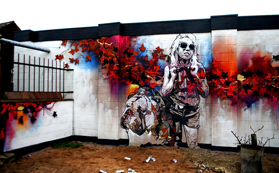
So when he eventually got round to talking about the actual brief and not himself it turned out the part with him involved was us working together to make a boardroom camel of a mural design that he can go and paint and take the credit for like he did with all the other nameless artists he's worked with.
Also Paul told us later that this guy had taken the credit for the stuff Paul did at light night last year which just angered me more.
So when he eventually called a short intermission in the endless soliloqy of the life and times of Pete Barber I chose to not return.
And I am contented with that decision.
The end
Frankly I regret it slightly.
Although I'm not sure what I was expecting
Anyway the first hour was a marketing woman from plusnet talking about plusnet's highly reductive marketing.
Basically BT bought them and they decided to whore out the Yorkshire stereotype, which I always find particularly irritating, but more so in this scenario.
They use the assumption of the Yorkshire people being simple and honest and create a trustworthy brand front of people that are far too well meaning and non-complex to fathom how to screw you out of your money.
We all live in humble stone cottages in the rolling hills and keep pigeons and subsist on tea alone and say ee by gum to communicate any emotion.
Anyway they want a pretty picture, preferably Yorkshire themed but it apparently doesn't have to be, to put on the big ugly and very shadowed wall behind their Leeds building.
The next bit was Pete Barber indulging in himself for the better part of two hours.
He annoyed me because he was clearly in love with himself and kept going on about how much he knows about paint and how he jsut wants to be the greatest painter ever(which is not much to ask really is it nahh), and ALL HE DOES IS COPY OTHER PEOPLES WORK ONTO BIG THINGS. Hack fraud. It irritated me a lot, because you don't deserve to be so self important if you are literally like a photocopier that can transfer onto walls and cars. No way man. I wouldn't mind if he weren't so incessently boastful, like if he said yeah I paint stuff onto walls that other people did, no biggy, but he basically took all the glory for all these other illustrators because he used some fancy ass paint to transfer it onto a ferarri. Half way through I began to get really irritated, particularly as there was lots of work I would've been doing had I not made the heinous error of attending this briefing, so I started inventing some heady leggy musical instruments to quell my frustration.
At one point he did show us some of his own work and it was horrible, truly cementing in my perceptions of him and his integrity as an artist. It was that kind of work that was everywhere in like 2004 with a line drawing of a pouty California girl in aviator sunglasses and a halterneck top, with splashy garish colours all over the top.
Here I found one
So when he eventually got round to talking about the actual brief and not himself it turned out the part with him involved was us working together to make a boardroom camel of a mural design that he can go and paint and take the credit for like he did with all the other nameless artists he's worked with.
Also Paul told us later that this guy had taken the credit for the stuff Paul did at light night last year which just angered me more.
So when he eventually called a short intermission in the endless soliloqy of the life and times of Pete Barber I chose to not return.
And I am contented with that decision.
The end
Calendars

Taking a moment to boast about my great calendar
its a page a day calendar of New Yorker covers
How nice is this one its marvellous
wait I'll get a better picture

yeahhhh
look at that
Parade Banner
So after my sketching I drew out the parade in coloured pencil and fineliner.
I didn't want it to look too laboured so I drew the characters quite instinctively instead of planning each one, this way I think they look more born from the same world.
It's been a while since I've used fineliner, its quite nice. Mostly because it's so easy. There's no fuss or sharpening or direction of stroke consideration. Just making lines. I like it, it's nice to sketch in as well, very immediate medium.
Here's the line drawing.

In reflection I think subconsciously I took inspiration from Bendik Kaltenborn's signing of my copy of Adult Contemporary, particularly the lettering. I like his visualisation of sounds, like the banner on his website thats a gun or something.
Anyway I'm pretty satisfied with this, I think it works as an image and represents my practice and I pretty well.
My favourite is the guy at the back who was late for the parade.
And the tiny guy who was inexplicably tasked with holding the biggest sign.
I think the world, and my work, could do with some more visual comedy.

I found it it's a gun

Subscribe to:
Posts (Atom)