At present, my practice is solely illustrative. It is based around drawing, both traditionally and digitally, in a range of media for different purposes. The key aspects of my work are colour, character and visual silliness, applied to many formats including publications, book and album covers, posters and promotional material, pattern, comics, and editorial work.
Currently I don't see a particular visual tone that ties my work together, in the way that many practitioners have a 'style', but I think it is unified by my drawing process and the tone of voice behind it. I am looking to pursue this to make a body of work that is more visually consistent but is never repetetive, because when it becomes boring to make it becomes boring to look at.
In terms of the next year I plan to work part-time in my dentists job to keep the motivation it gives me to be a creative practitioner, but at the same time I will continue to look for jobs that I actually want. I will be doing my placement at Hallmark and following that I plan to enquire about other placements and positions as an in-house illustrator so I will get to be honing my drawing skills as my job. I want to work freelance and hope to get representation from a reputable agent, but I will need to establish a client base first. In order to do this I will be sending my work to magazines, newspapers and publishers and making visits to local studios and any larger companies I can wrangle meetings at.
I think my practice fits best into publishing and editorial, and I would also like to dabble in advertising, purely for the for the financial gain. My key aim is to get my own books and stories published for an audience of children. I will continue to push the Heady Leggy universe and make more work based around it, intially as perosnal work but with a view to getting the work off the ground and either published or animated, just kickstarted in some format.
My main goal for the forseeable future is to be able to support myself through illustration, either freelance or as an employed creative of some sort, without having to have a horrible side job where people vomit right in front of me. I think it'll take a lot of time and work to achieve, and I might never get there but as long as my day job doesn't make me utterly miserable then I think I'll be on the right track.
Thursday 21 April 2016
Summative Evaluation
This module has been invaluable in terms of preparing me for real life, moreso than any other year. Really the past two years of PPP have been preparation for this year
. I've now got a full consistent promotional pack that I'm happy to send out to people, in tandem with an online presence that functions and acts as a front facing platform for my practice. As a result I've been able to contact studios and publishers, to some success, and can continue to do so after the course has ended, updating this presence when necessary. My main success has been getting a placement at Hallmark for May, which before this module I don't think I would have got because I had no branding, no website, no portfolio and no impotace to contact people due to having none of these things. While I'm there I will be emailing other companies about placements to take advantage of my foot-in-the-door.I have also been able to expand my contextual refernces to broader practitioners which has enriched my work. Through Big Heads I've learnt about the practises of many admirable people which has reaffirmed that this is a potential career path, as long as I work hard as hell and put my work in front of people. My strengths in this module have been my branding, which I am finally happy with, and my engagement with other practitioners work. Sometimes I enjoy looking at work more than making it. I think I've engaged a lot more with the outside world of illustration and my potential place within it than I have any other year, and the benefit of this is that I have a better idea where I want to take my practice after graduation. At the end of last year I couldn't have pinned it down if I tried, where as now I now, at the miunte at least, that I want to work in publishing and editorial (perhaps advertising if the oppurtunity should arise) with my personal practise on the side where I pursue self published work to sell independantly. My weaknesses have been waiting till quite late to start contacting agencies and publishers, and people generally, but I felt like I wasn't ready to do so until my branding was done and I had a portfolio I was at least partially happy to show. Now that I've started though, I can continue to do this thorughout my career as it will be a good way of getting in contact with potential clients and getting advice and befriending other practitioners. Over the summer I plan to build on this start I've made in contacting people and post out some physical promotional packs as well as make personal visits to art directors and companies I'd like to work for. This is something I haven't felt comfortable doing yet but with the end of this module I have a completed portfolio, promo pack and set of people to contact and thus am more prepared for the next step in networking.
This is the first time there hasn't been a need to state what I'll do in this module next year, more of stating of what I will take from this module into the rest of my life. That will be most of it; what I've learnt about the business end of things, like invoicing, copyright, licensing and costing work, the promotional aspects of having consistent and functional branding and getting people to see it and engage with it, and the engagement with other practitioners and what is happening outside of my deskspace, which I've come to think is very important or ones practise becomes very insular and ignorant of what's happening in popular illustrative culture.
So basically PPP is a practice run for all the bits of an illustration career that arent the actual drawing, which has turned out to be heck of a large portion of it.
Tuesday 19 April 2016
Semi google-able
I googled myself to check how finable I am.
Now when you google Hollie Smith you unfortunately get a soul singer from New Zealand, which I have known for a long time and one of my personal goals is to become more famous than her so she can know how it feels.
 Same spelling and everything
So I google hollie smith illustration which yeilds more positive results
 My sites are all there, including my very recent account on The Dots oddly, so maybe I should make better use of that. So web wise thats not bad, I'll give myself a 6 out of ten
Image results are patchier, in fact most of the results are images I've pinned on pinterest on my illustration board, but there's a fair bit of my work scattered about. 4 out of 10

 Now to take over the web.
Onwards and upwards
Mehhhh ykno its not a bad result for a Smith. We're very hard to find, as a result of being so easy to find. Like finding a tree in a forest. They're everywhere is my point. Hollie is not uncommon either.
Now when you google Hollie Smith you unfortunately get a soul singer from New Zealand, which I have known for a long time and one of my personal goals is to become more famous than her so she can know how it feels.

So I google hollie smith illustration which yeilds more positive results

Image results are patchier, in fact most of the results are images I've pinned on pinterest on my illustration board, but there's a fair bit of my work scattered about. 4 out of 10


Onwards and upwards
Mehhhh ykno its not a bad result for a Smith. We're very hard to find, as a result of being so easy to find. Like finding a tree in a forest. They're everywhere is my point. Hollie is not uncommon either.
Outrage
Some guy called Luke has taken my ghost hands pattern and pasted some type over it and put it on his blog.
NAHHHH MATE. Nope

I mean yeah he credited me, but there isn't a link and that type looks ugly and he does not possess the right to alter my work in any way.
So I told him

NAHHHH MATE. Nope

I mean yeah he credited me, but there isn't a link and that type looks ugly and he does not possess the right to alter my work in any way.
So I told him

UAL Children's Book thing
I emailed about a call for a childrens book illustrator on the UAL oppurtunities site a bit ago, got this response back, which is probably my nicest rejection yet because it contained actual feedback.
 Now I'm just waiting for her to explain what this Q-Tales platform thing is, because it sounds good but it's easy to make stuff sound good.
There's two website results for q-tales
Theres the .eu site

And theres the .com site.

Confusingly theyre both related to childrens books but I think it's probably the latter.
It's worth noting that neither have a public showcase of portfolios so I don't think it's anything to get too giddy about. Unless its like a super secret members only club where all the publishers prey on portfolios. who knows.
Milena knows. She just hasn't told me yet.
Boards, redone
So I wasn't happy with how my boards looked and tried reprinting them in the computer suite on Antique White to see if that went any better.
It did, which meant I could alter them. Which is a good job because Patrick found some typos.
So I've revamped them a little now and added more to my promo pack, and put my CV on too.
I think they look a lot better now
Board reprinting
I printed the boards out again in the computer room on antique white and they look waaaaaay better
Here's a comparison
 The colours sit a lot better on the offwhite than the start white
I've redone them all like this

Here's a comparison

I've redone them all like this

Monday 18 April 2016
Art Market
Got the response saying to be sure I attend the briefing on May 23rd, which, alas, is the first day of my placement - obvious priority.

So emailed back to say so
So they said I just need to get someone to get the booklet for me basically so that's all fine, hopefully i will be selling in the market.
I think I'd like to put a couple of copies of heady leggy book up there but if its just prints I can sort that out too.
Presentation
It's well established that I hate presentations, or even just talking in front of more than four people, so this was like ultimate worst nightmare - presenting my practice and degree and career plans in front of everyyyyonnnee.
I was even nauseous/nervous while making the presentation, the distress basically made me ill. And in the running order I was second to last, so I had the stress dragged out over two excrutiating days, which definitely hindered my enjoyment of everyone elses presentations. Saying that I did still enjoy watching everyone, even though it took fooorrreveeerrrrrrr, but it was nice seeing where everyone is at now and how they got there, and theres a massive diversity in everyones practises. Although watching how great all the other presentations were just made me dread mine even more.
When it came to it I was basically sure my throat was gonna close up and I'd choke and die at the front of the room, but I didn't so that's a success.
I really have no idea how it went because it was a surreal blur and I can't remember anything I actually said. This year I had notes on the screen under the slides because from the past two years I've learnt I can't read sheets of notes when I'm presenting. Or read at all it turns out because I mostly ignored my notes and blabbered on about I literally can't remember what. It has been repressed from my brain.
My feedback was fine, just affirming that the presentation was alright and I need to figure out where I sit in the industry, but I have forgotten a lot of that because of my temporary presentation stress induced amnesia. I ran over a little bit too but I don't know how long because the timer restarted when I had to quit powerpoint to make my images happen.
But it's over now and I won't have to do it again, except in future career and probably all the time. At least I've got better at it over the three years though, it's now vaguely coherent, I just hope presenting won't form the basis of my practice in future.
Promo Pack
I've finsihed my promo pack plane.
It all goes in a patterned envelope.
There's my CV, bookmark, business card, mini portfolio and a sticker.
Here's an image
 I think I'll be able to keep on top of printing and sending this out because it involves minimal paper crafting and glue, which always ends up disastrous.
It all goes in a patterned envelope.
There's my CV, bookmark, business card, mini portfolio and a sticker.
Here's an image

Sunday 17 April 2016
Lisk Feng
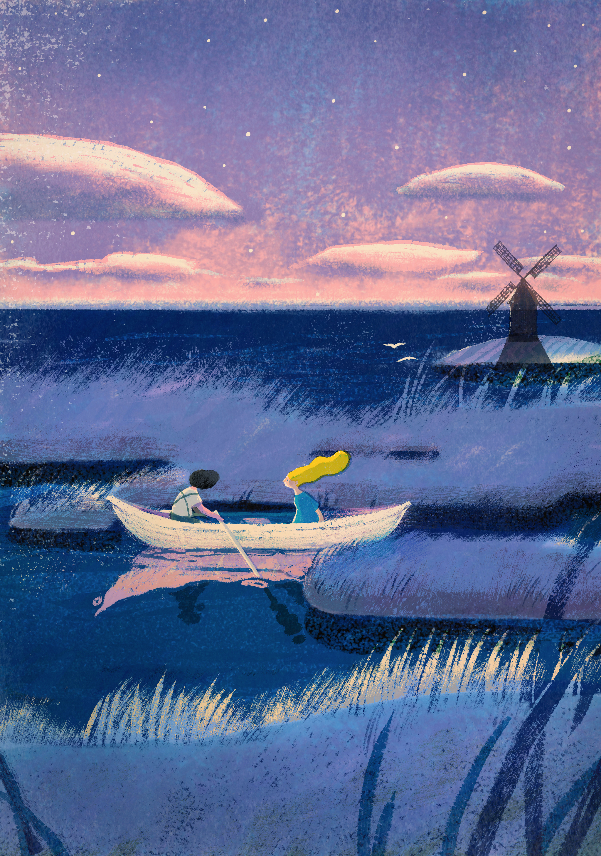
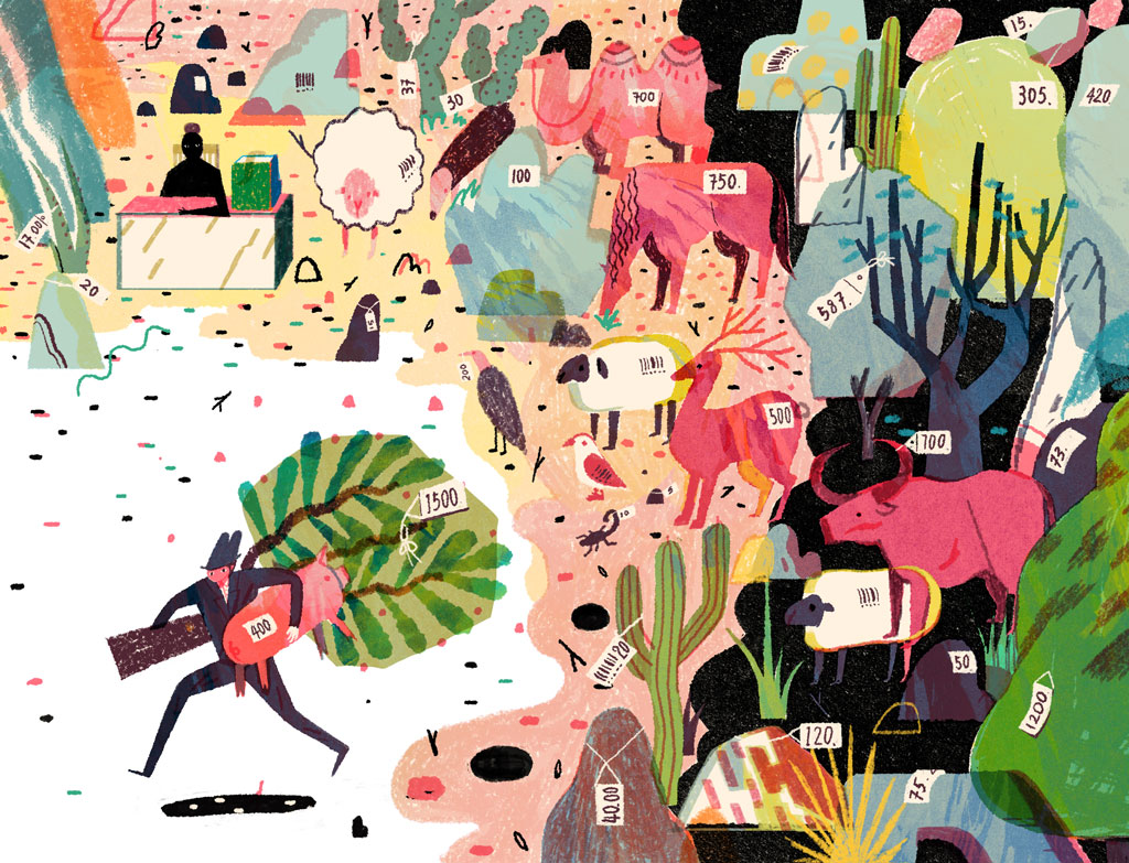
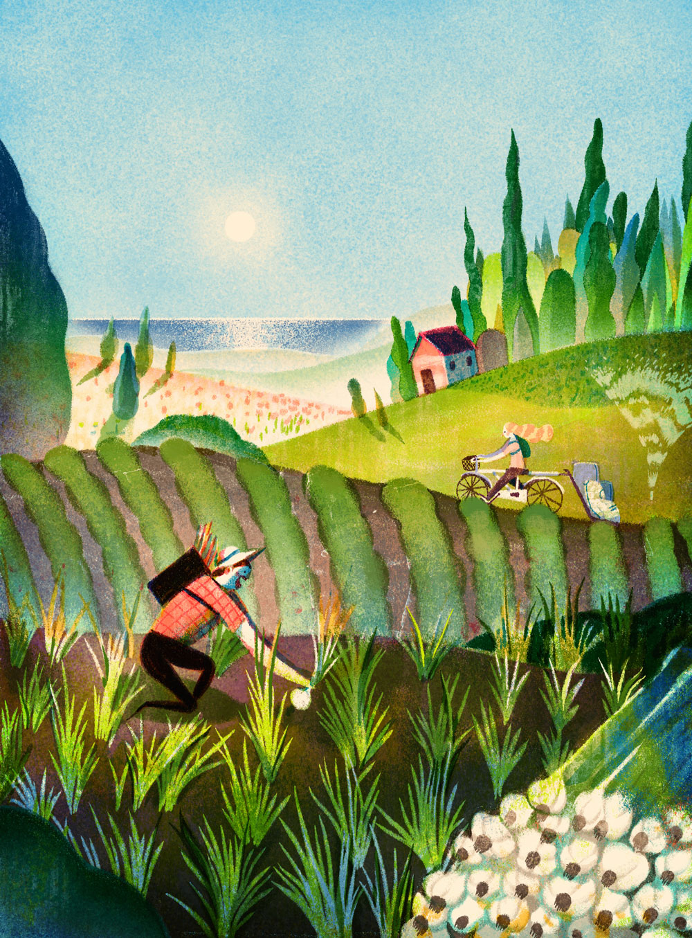
Lisk Feng is one of my favourites at the minute, and for a while now.
She's great, great colours, composition, clarity, charm. She's got it all
I can't figure out her process
It looks like a digital traditional hybrid
Or maybe she's just really good at either one
I really can't tell
Her practise is quite varied, she seems to work commercially for editorial and advertising but also has done comics and has personal work that seems to feed into her commercial projects.
It's basically the career I want, editorial and advertising for money, comics, books and personal work for fun and sanity.
Here are some favourites
Pink and blue, classic.
The yellow really POPs out too
Great clouds
Textures, what are they, natural or digital
How did she doooo this
I think, on closer inspection it might be digital painting, textured brushes.
So anyway I emailed her today
This is said email

Hallmark research
I never really considered greetings cards and whatnot as part of my practice.
Not that I don't think I would do it, I've just never actively done it, other than cards I've made for family and friends birthdays and weddings and stuff.
I also am realising I know little to nothing about card trends and whats going on in that industry at all
I never even buy greetings cards because I make them
But the ones I make are either horrible through request, or very specialist to the person I'm making it for.
So I'm doing some research
Tigerprint and Hallmark seem to have murged
Here's some of Tigerprints offerings through M&S


Follow Hollie's board Greetings Cards on Pinterest.
Not that I don't think I would do it, I've just never actively done it, other than cards I've made for family and friends birthdays and weddings and stuff.
I also am realising I know little to nothing about card trends and whats going on in that industry at all
I never even buy greetings cards because I make them
But the ones I make are either horrible through request, or very specialist to the person I'm making it for.
So I'm doing some research
Tigerprint and Hallmark seem to have murged
Here's some of Tigerprints offerings through M&S
Yep this is nifty for mainstream humour
I'm on board
This ones quite nice
Quite twee
I guess a lot of cards are twee
I can probably do twee
Maybe
This is pretty
I'm not great at flowers though
Flowers seem to be a strong motif throughout
Obviously
This ones a really lovely drawing tainted by the record wheels gimic.
What is the relevance of the record wheels
They just distract unnecessarily from the charm of that ink line
I've made a pinterest board of the kinda stuff going on on pinterest
The beating heart of twee craft illustration
It looks like I'm gonna have to practice my naive hand-drawn type
Follow Hollie's board Greetings Cards on Pinterest.
Sarah Benning
This lady has got it sussed
She makes illustrative embroideries of plants
They're really lovely and sell for a buttload of money

She makes illustrative embroideries of plants
They're really lovely and sell for a buttload of money

Apparently it takes a very very long time, which warrants the high price
I wonder what this equates to as an hourly rate
i mean I'd like to try this but I don't think I have the patience
Friday 15 April 2016
Disheartened
I'm finding this emailing lark a little disheartening because none of them will reply to me.
I'm gonna stop emailing companies and art directors and start emailing practitioners instead.
I'm gonna stop emailing companies and art directors and start emailing practitioners instead.
Thursday 14 April 2016
Hallmark weeeeeeeeee
So I emailed about a placement at Tigerprint/Hallmark on Monday and this morning I got this back

Eeeeeee hahahaa excellent
One wonders of the motives for mentioning the limited spaces. To make me answer quickly probably.
This also presented decisions whether to commute or accomodate.
I chose accomodation because it starts really early and I'd probably have to get a train like before seven and I am not up for that.
I responded

 Began to dispair as they all looked terrible, was hoping for later in the year, after 17th preferably
But cross-referencing estudio I noted that 23rd of May is after 603 deadline and 3rd of June is right before the show prep week starts. Perfect!
So I selected these dates

The info she sent through was as follows
A very long email about logistics

So yehh I am very excited now
I think this'll be good, Rosie enjoyed hers so I'm sure I will too.
It doesn't say if they have tablets and photoshop but I assume they do
Also I need to figure out whether to get the two weeks off work because it'l be an absolute ball ache going back for the four hour evening shift, and I'd spend as much as I'd make just getting there. I'd have to get the taxi to saltaire station then the train to leeds, taxi to work, taxi from work to station, train to salraire and taxi back to the accomodation, which would equate to about £22, and in the four hour shift I would make about £23, so I think I'm gonna book that off.
Exciting though
Proper company and pro people
Now I need to decide what piece of work to send back as my favourite.

Eeeeeee hahahaa excellent
One wonders of the motives for mentioning the limited spaces. To make me answer quickly probably.
This also presented decisions whether to commute or accomodate.
I chose accomodation because it starts really early and I'd probably have to get a train like before seven and I am not up for that.
I responded

She offered me these dates

But cross-referencing estudio I noted that 23rd of May is after 603 deadline and 3rd of June is right before the show prep week starts. Perfect!
So I selected these dates

The info she sent through was as follows
A very long email about logistics

And this document
So yehh I am very excited now
I think this'll be good, Rosie enjoyed hers so I'm sure I will too.
It doesn't say if they have tablets and photoshop but I assume they do
Also I need to figure out whether to get the two weeks off work because it'l be an absolute ball ache going back for the four hour evening shift, and I'd spend as much as I'd make just getting there. I'd have to get the taxi to saltaire station then the train to leeds, taxi to work, taxi from work to station, train to salraire and taxi back to the accomodation, which would equate to about £22, and in the four hour shift I would make about £23, so I think I'm gonna book that off.
Exciting though
Proper company and pro people
Now I need to decide what piece of work to send back as my favourite.
Wednesday 13 April 2016
Labels..?!???
I'm confused about labels because the module information says
 and the briefs on estudio say

So is there any defined label for sb1 and sb2???
I think my labelling stystem is working though so I'm going to use that.


So is there any defined label for sb1 and sb2???
I think my labelling stystem is working though so I'm going to use that.

Brusha brusha brusha
Y'know that bit in grease where Jan does that brusha brusha thing
 That bit
Well I watched the advert cos I was on this website
http://thecartoonguru.blogspot.co.uk/2011/03/well-be-right-back-part-3.html
And it's really great
Really good 50's space future aesthetic and great character movements
Turns out he was actually a Disney character designed by Tom Oreb, one of the cartoonists responsible for the cartoon moderne style.
Here's some of his work.
It's really just excellent.
Like a how-to guide in character design
So much movement in static imagery
GREAAAT legs
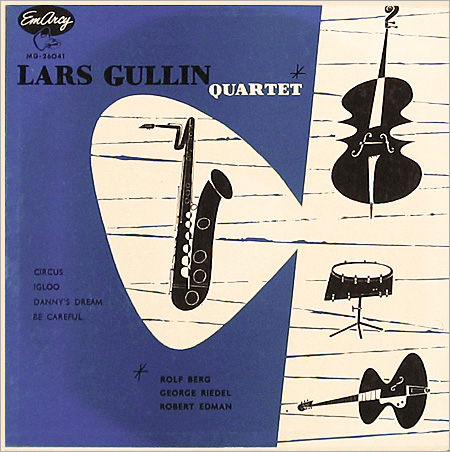
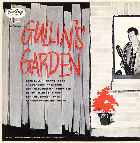
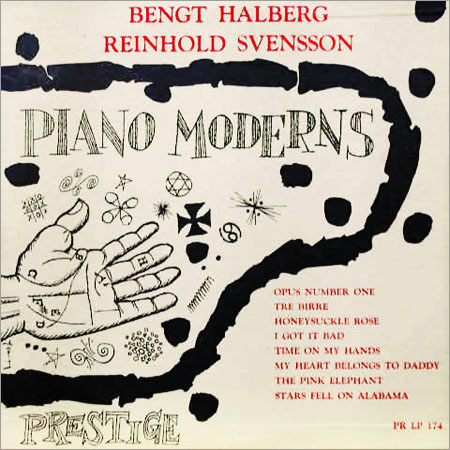
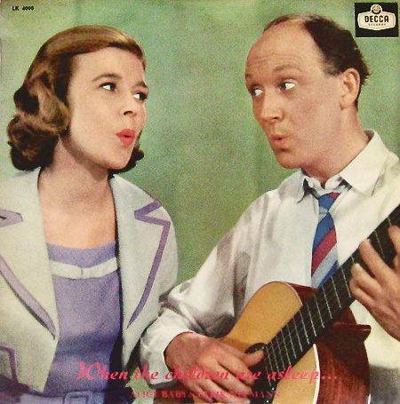
Swedish 50's jazz album covers
Found this blog roll of rare swedish jazz ablum covers from the 50's
I mean I'm already pretty into jazz album covers from the 50's generally and like Jim flora and such but these are reeeally great
http://www.birkajazz.com/archive/sweden_2.htm
Some faves
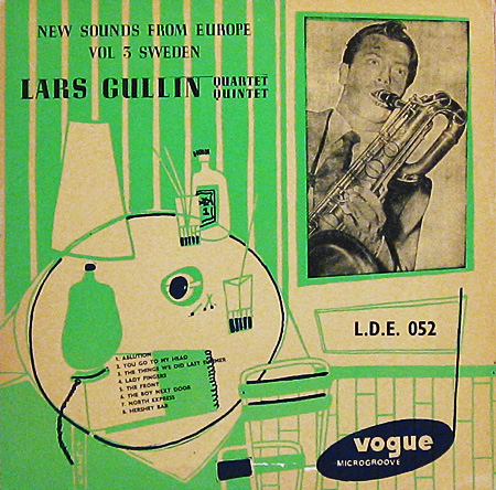
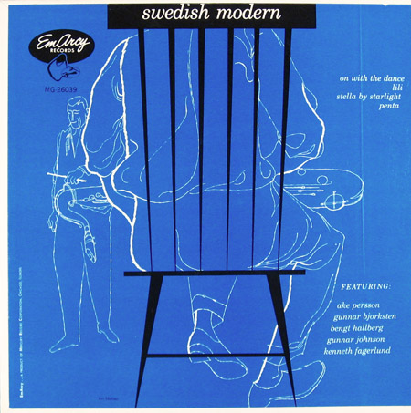
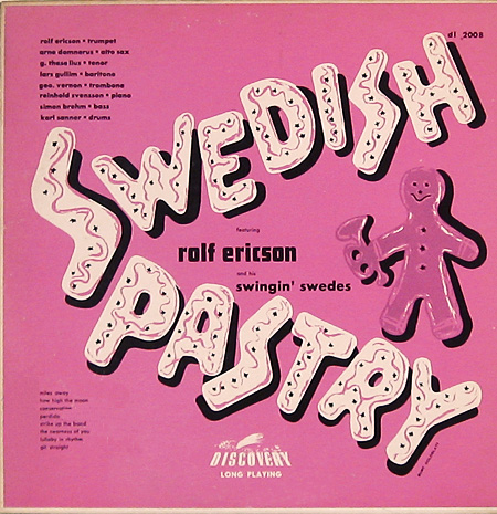
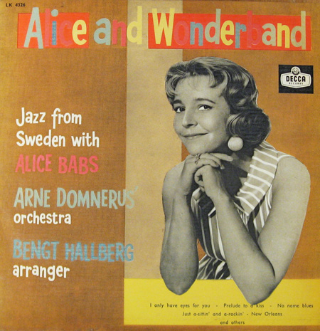
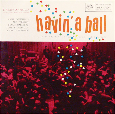
I mean I'm already pretty into jazz album covers from the 50's generally and like Jim flora and such but these are reeeally great
http://www.birkajazz.com/archive/sweden_2.htm
Some faves
Tuesday 12 April 2016
Response from Peter Allen
sent me this email back, so maybe if he remembers he will email me at some point
Seems like a nice chap and its basically the first time someones replied to my questions

Seems like a nice chap and its basically the first time someones replied to my questions

CV
I've made a new CV.
It had to be in keeping with my branded aesthetic, i.e primary colours, character parade banner, dots and dashes pattern.
I looked at a bunch of 'creative CVs' on pinterest and what not and some had good ideas but mostly they were just naff and gimicy

 So yeah I wanted to keep it kinda basic, like a normal CV but pretty and colourful and consistant with my branding.
I made a CV in summer when I was unemployed and dirt poor, and it ended up getting me the job because non-creative people (sometimes) dig that stuff.
This is the summer CV
 Looks alright but I've moved on.
Gotta throw some yellow into the mix.
Here is my new one.
 I really think it screams in your face
AAAHHRG. READ ME.
But yeah I like it, it's waht I'm about right now and all that.
Patricks advice was remove some jobs and put the education in order of most recent first, which I have done, and I have removed Till Operator at KFC and event catering staff. Nobody has to know.
I've put my placement on cos deleting some jobs freed up extra space, and its a big thing, don't think it matters that I havent done it yet. And when I have I can change it to past tence.
Tried to keep it short and light. Nobody wants to be bored reading a CV, or for it to take longer than 5 miuntes.
I will have to update my portrait at some point though since I had a mid youth crisis and cut all my hair off.
It had to be in keeping with my branded aesthetic, i.e primary colours, character parade banner, dots and dashes pattern.
I looked at a bunch of 'creative CVs' on pinterest and what not and some had good ideas but mostly they were just naff and gimicy
I made a CV in summer when I was unemployed and dirt poor, and it ended up getting me the job because non-creative people (sometimes) dig that stuff.
This is the summer CV
Gotta throw some yellow into the mix.
Here is my new one.

AAAHHRG. READ ME.
But yeah I like it, it's waht I'm about right now and all that.
Patricks advice was remove some jobs and put the education in order of most recent first, which I have done, and I have removed Till Operator at KFC and event catering staff. Nobody has to know.
I've put my placement on cos deleting some jobs freed up extra space, and its a big thing, don't think it matters that I havent done it yet. And when I have I can change it to past tence.
Tried to keep it short and light. Nobody wants to be bored reading a CV, or for it to take longer than 5 miuntes.
I will have to update my portrait at some point though since I had a mid youth crisis and cut all my hair off.
Jennifer Nelson
I follow Jennifer Nelson Artists on instagram and theres some nice work on there.
Quite different to mine, but nice to look at

I found her on linked in and now we are 'friends
 It's basically a small agency run by this woman
Seems a very nice agency to be represented by, very personal and caring and whatnot
If I were to be represented I'd like an agency like this, seems very friendly and nice
Not like the souless face of corporate art.
Anyway she has this page specifically for all the illustators who contact her for advice, which I just thought was really refreshingly kind and genuine, in this seemingly cutthroat passive aggresive industry I'm becoming increasingly disenfranchised with.

So I contact her asking for advice about my portfolio and graduating
Hopefully she will respond
Here is my message;
Quite different to mine, but nice to look at

I found her on linked in and now we are 'friends

Seems a very nice agency to be represented by, very personal and caring and whatnot
If I were to be represented I'd like an agency like this, seems very friendly and nice
Not like the souless face of corporate art.
Anyway she has this page specifically for all the illustators who contact her for advice, which I just thought was really refreshingly kind and genuine, in this seemingly cutthroat passive aggresive industry I'm becoming increasingly disenfranchised with.

So I contact her asking for advice about my portfolio and graduating
Hopefully she will respond
Here is my message;
Hi
First I'd like to say this is a very good idea and I think it's admirable that you so willing to offer help and guidance to struggling artists.
Basically I'm about to graduate from BA Illustration at Leeds College of Art and I'd like a professional opinion on my portfolio. Also any tips and guidance you have for what one should be doing after graduation to crack into the industry would be massively helpful because it seems quite enigmatic at the minute..
Here's a link to my portfolio
https://issuu.com/hs109802/docs/portfoliosmaller
Kindest Regards and thanks for your time
Hollie Smith
Subscribe to:
Posts (Atom)