I decided to use the line technique I practised before, using a dip pen and ink to create more textured but sturdy and precise lines.

I filled the panel more with his body so it didn't appear as empty as my previous attempts

I like this donkey drawing because I've managed to keep it ridiculous, I aimed for him to look brainless and joyful which I think I achieved.

Added more detail to this panel to make it look more like a sponebob-realism close up. I'll change the error in the speachbubble in Photoshop

Accidentally picked up a thicker nib for part of this drawing, but I dont think its too noticable. I decided to add the backgrounds digitally later and not use outlines so they would recede rather than becoming confused with lines in the foreground. The pose in this drawing isnt as flaboyant and amusing as previous sketches but I think it's a little sassier which is just as good.

Overlapped the arm and the speachbubble, I hope it suggests the continuousness of the laughter almost like a constant background sound for a long time.

Startled face, emphasised my expressive lines. Considering a plain, almost black background, to communicate his sudden shock and realisation of death. Also it took me a while to pin down how to write this sound. For so long Hugh seemed like the only logical way to spell it..
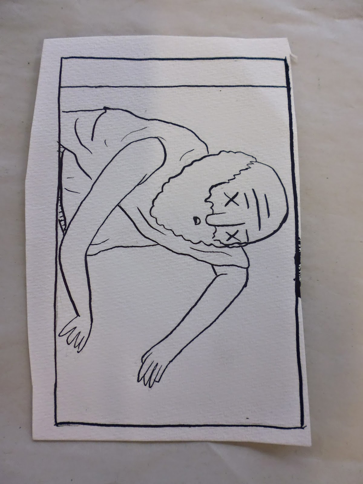
A slightly confusing angle but much better than the original sketch. I made the shot closer to show his dead face and fill out the panel better. His limbs flopped quite awkwardly though.

This is my final shaded version. I used three shades of grey at varying opacities to build up tone and texture. To avoid the annoyingly sharp look my previous comics have taken on during digital colouring I opted for loose textured brushes like sprays, air brushes and chalks. I think this went quite well as these brushes layer well on top of each other, especially in the close up image as I could create a haggard tone across the skin. I'm pleased with my decision to draw the backgrounds straight in with textured brushes as it makes them look looser and less dominant in the frame. Some of it could stand to be a little tidier or perhaps more detailed though. I think the shadow and textures are what finished off this comic as before it looked bare and dull, but there's a few messy parts that I will likely change before printing for the show.

An A3 print out of the comic, in which ALL errors are strikingly visible, and an A5, the size it will appear in my finished comic book. It looks better here as you can't see all the errors I made and everything looks crisper and tighter.
No comments:
Post a Comment