Since I decided to only fine-tune one comic in time for the deadline I have more time than previously to develop the story and drawings.

Started with loose pen drawings of Chrysippus, using internet reference, practicing laughter positions.

Tried cross hatched shading on face, could be good if it works everywhere but very labourious for potentially disappointing results

Warping his laughing gestures for comedic effect, crazy body

Practising facial expressions

According to reference imagery. Baldness and a beard are nice elements to base a character around as its a distinctive look.

Practising pointing and laughing, experienced some hand drawing problems, such as which side would a thumb be on. Also I tried using dip pen and ink to create a different line quality to my pens, its scratchier and more textured and immediate.

Decided upon three shades of grey as shading. Here I used copics to colour the figures but discovered that my ink bleeds when next to the light grey pen, so I can't use this technique for the final comic.

Tried hatching again to a lesser degree of success, also must sort of smudgy drawing quality if I plan to use this inking method in my final outcome

Pointing hand is improving here, stance is more relaxed

Very rigid pose and confusing hands

Tried working on large sheets for a while, it felt much freer but its very impractical to carry around

Trying to make his hand jaunty and frivolous

Hands are improving, fleshier here, less scratchy, not sure which is better

Hand practice, trying to find the right amount of splay between fingers

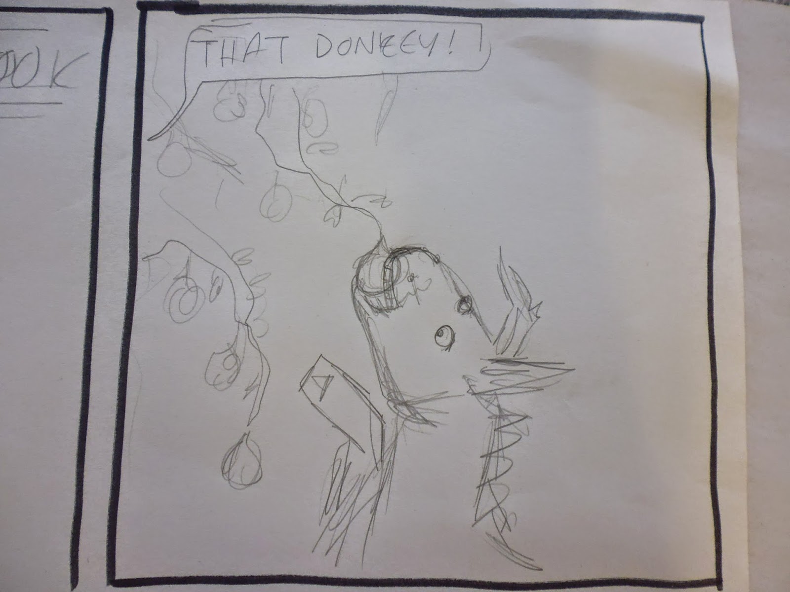
Drawing a more realistic donkey and tree, still needs further use of reference imagery though.

Confusingly close together arms, I put a lady on the other end of them for my own amusement.

Trying to make the face and laughter as expressive as possible

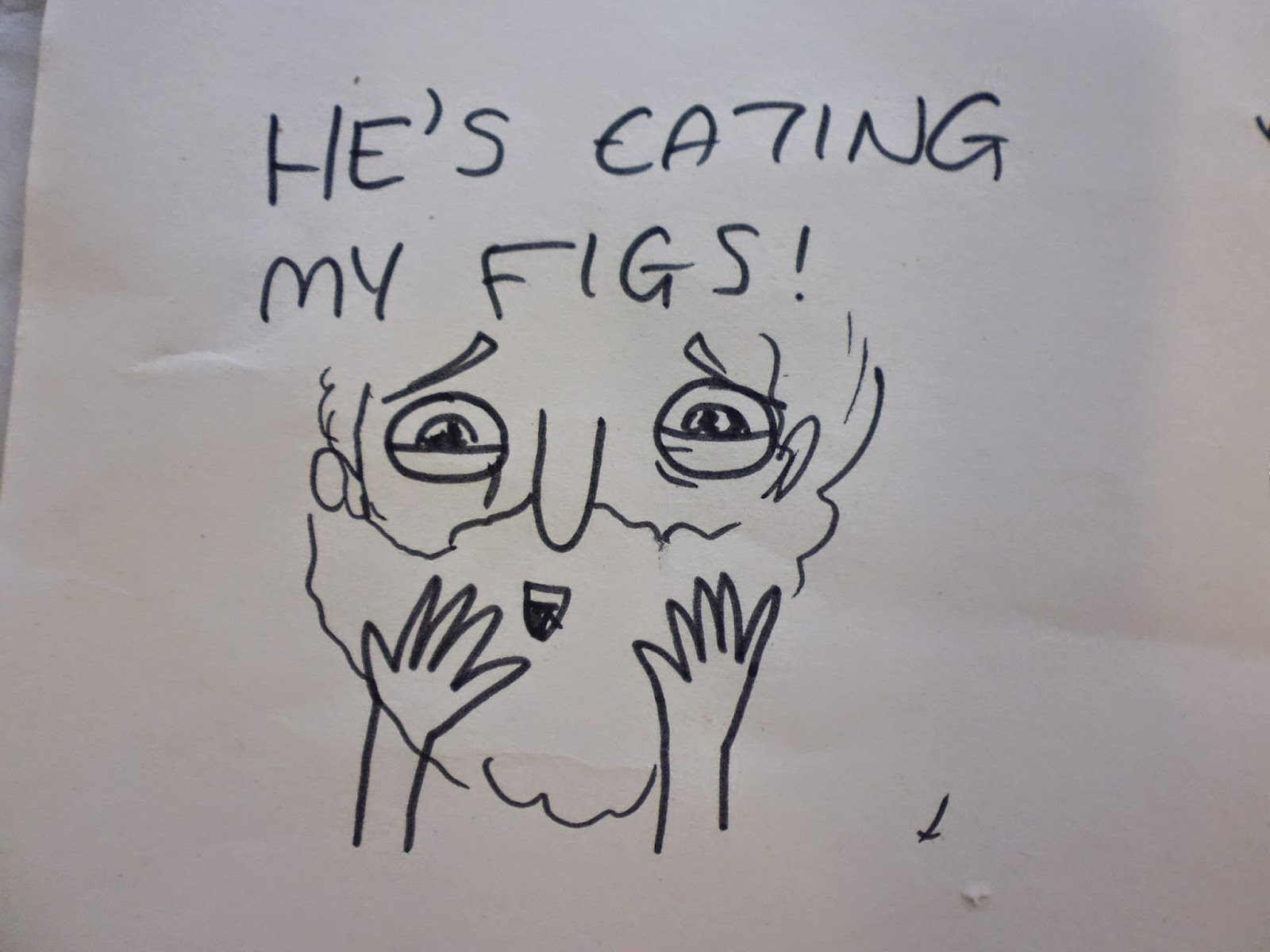
Practising the startled death face

My first coherent plan for this comic. I think that since I drew this straight into pen, thus keeping all the funny mistakes, that when I eventually make a considered, sketched and inked drawing it won't be as playful and entertaining. Maybe I'll do a perticularly light sketch for each one, just to show the placement of the elements.

Pose and compostion too rigid, need to crop to torso and perhaps use arm on the other side so as not to create a confusing barrier across the panel. Also need to fill the background with some greek looking stuff.

I find this facial expression very entertaining, I think I captured the manic joy I was aiming for, but it may not carry through in later more detailed sketches

I made errors positioning this arm but I think its the funniest one I've drawn so far because of its movement and liveliness, which seems to come from drawing straight into pen

A close up of the slave because I thought his face was entertaining, he's just about done with Chrysippus' nonsense. In the end result the slave will be vaguely more detailed but I want to keep this basic expression

A jaunty knee slap to accentuate the laughter

Clutching chest to make death clear, startled facial expression could be more dramatic

Need to work out a better way to frame this last panel, definitely a closer angle

Considering putting a short explanation on each, similar to a coroners report, to sum up the comic and clarify any ambiguity. Ideally this would be unnecessary though as I'dve communicated it efficiently enough with my drawings.

A more laboured sketch of the comic, which did, as predicted, lose much of the charm of the earlier pen sketch.

Pose is too static, but more anatomically correct


Working out panel measurements with difficult and horrible maths.
No comments:
Post a Comment