Tuesday 27 May 2014

End of Module Evaluation


Leeds College of Art
BA (Hons) ILLUSTRATION
Level
04
OUIL402 Personal & Professional Practice 1
Credits
20
End of Module Self Evaluation


NAME


 Hollie Smith


1.  What learning have you inherited through this module and how effectively do you think you have applied it? Consider differing approaches to contextual/professional research
I think I've put a more concentrated effort into looking at other practitioners work, rather than absorbing it passively, because the tasks required us to find specific things it made me more rigorous with my research, which led me to discover many new illustrators who have inspired my projects in different ways. I've also developed the ability to talk in detail about my own practice and goals, where in the beginning I would've been stumped at many of the questions posed in various tasks, now I've learnt how to critically sum up my attitudes to work which has helped me make sense of what I'm doing.


2. What approaches to image making have you developed during this module and what informed such ways of working? 
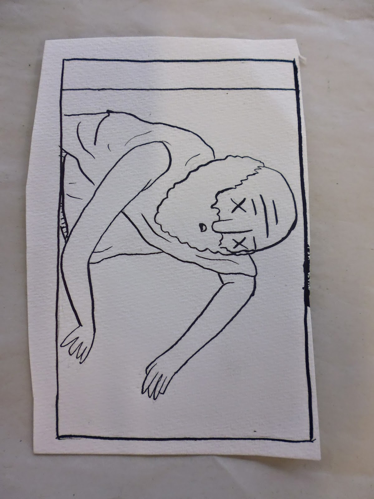
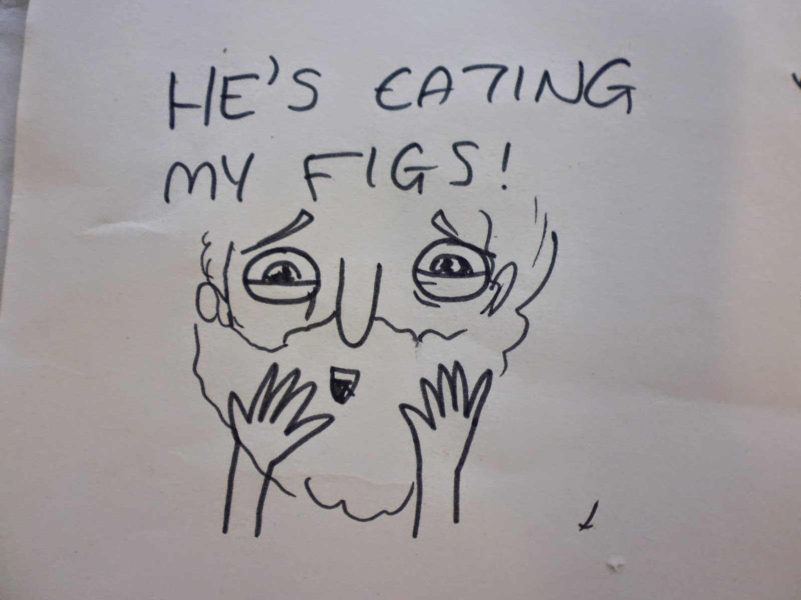
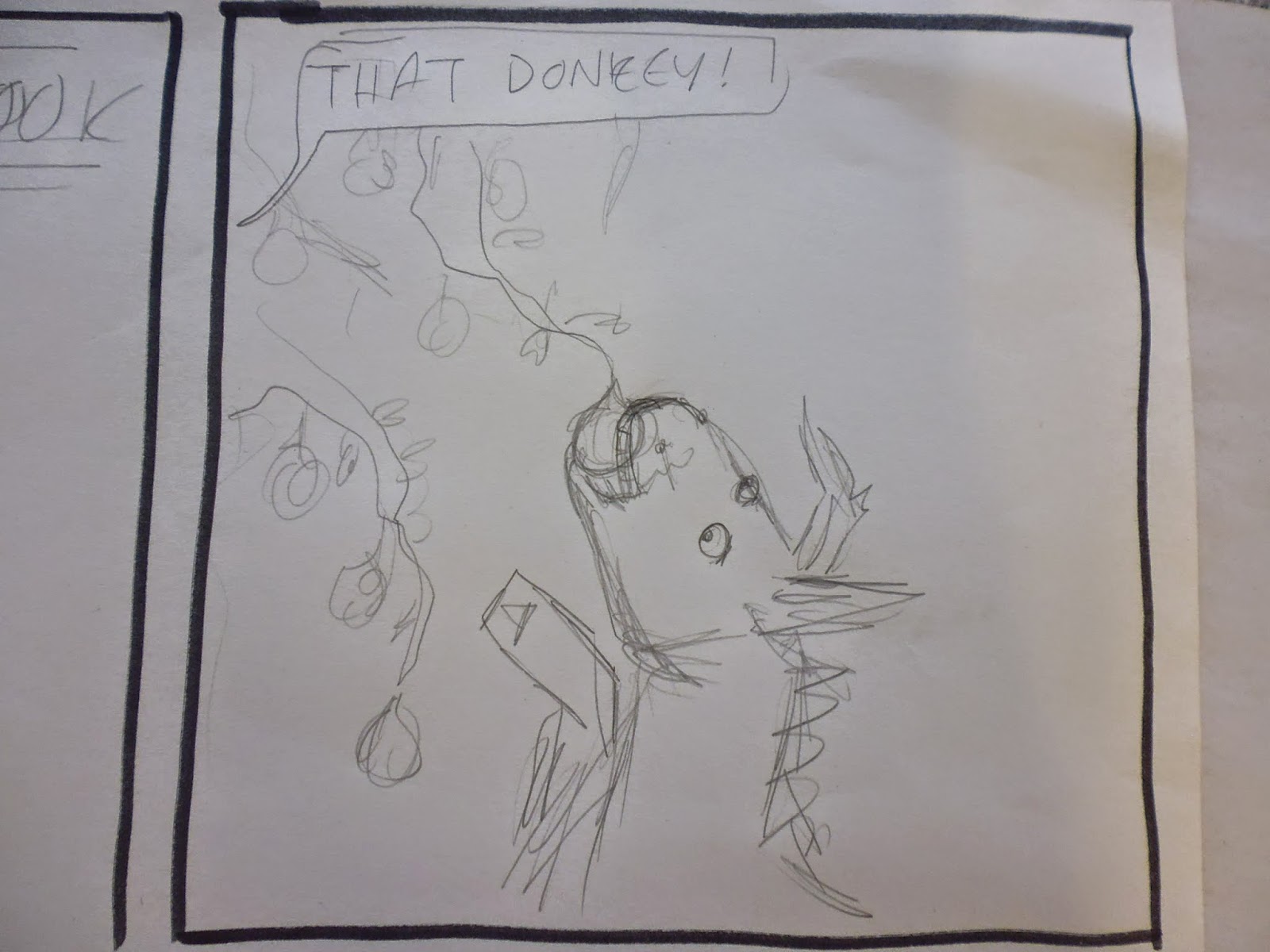
During the final brief I experimented with my linework and used a dip pen and ink rather than my usual brush pen, which I think gave me a neater and more controlled line that still stayed adequately playful. This was informed by the time I spent experimenting and developing my comic, testing out several different line making tools. I also tried using a wider variety of Photoshop brushes than usual, testing and building up different textures whilst shading the linework. I used this to progress on my use of textured brushes in the last module where the end result was still quite clean. It was inspired by other practitioners I'd researched through PPP and their use of such brushes to create a distressed texture, as well as Harry Clarke's fairy tale illustrations which have a genuine aged texture I've tried to imitate. 

3. What strengths can you identify in your practice and how have/will you capitalise on these in the future?
I think I take inspiration from a breadth of different subjects which helps to inform my practice. Also the work I need to look at and reference often falls conveniently in line with my down-time hobbies, i.e reading comics and watching cartoons. I think that my work is always best when it stems from a subject of genuine interest, which is why also I chose to pursue a topic of recreational research for my project. I want to continue making projects based on things I have a seemingly useless interest in because I think it makes the work more genuine and enjoyable. 

4. What weaknesses can you identify in your practice and how will you address these in the future?
Yet again my weaknesses have been not allowing enough time to complete the project I set out to do and negletcing to keep up to date with my blog, although this time I did write entries to which I added photos later. I think I dealt reasonably with the first problem by cutting down my workload and spreading it out over a longer period of time after the deadline but in future I will be more realistic about the time I have available and what I can achieve in it. With regards to the blog the only thing I can do is dedicate a regular time slot to update it starting next year, this way I won't forget and get carried away with the project.

UPDATE: Also next time I will not forget to publish all my draft posts that were awaiting photographs as it gives the false and potentially jeopardising illusion of an empty blog

5. Identify five things that you will do differently next time and what do you expect to gain from doing these?

1. Plan my project according to how much available time I have rather than just whatever I want to make. This way I hope to feel more satisfied with my final outcome.

2. When given an open brief I will look straight to my areas of recreational interest and research first instead of struggling to come up with a topic for ages and then ending up too stuck to do anything. By doing this I'll hopefully be able to spend more time on the project itself.

3. When given small tasks as in the earlier stages of PPP I will do them as soon as possible and not leave things until the deadline six months away, because that abstract date in the future will come and I will forget how much there is left to do. Thankfully I didn't do this to such a severe degree on this module but if I stop doing this all together I expect my levels of stress arounpinnd deadlines will dramatically decrease. 

4. Make sure I am constantly engaging with other peoples work, because I was doing this at the beginning of the module and it was really helping, but I got too lapse as the year went on and often neglected to look at anything or even keep reading comics. With my only contextual reference being cartoons for a few months I think my work may have suffered compared to had I been looking at a wealth of different images instead. 

5. Blog more frequently of course, but more specifically for this module I should have blogged more about things I'd been doing outside of college which were worth mentioning. I think it would've helped me when looking back on the year and pinpoint my sources of inspiration. Also it would encourage me to engage with things like that more often.


6.How would you grade yourself on the following areas: 
(please indicate using an ‘x’)  

5= excellent, 4 = very good, 3 = good, 2 = average, 1 = poor

1
2
3
4
5
Attendance


x


Punctuality


x


Motivation


x


Commitment


x


Quantity of work produced


x

Quality of work produced


x

Contribution to the group


x


The evaluation of your work is an important part of the assessment criteria and represents a percentage of the overall grade. It is essential that you give yourself enough time to complete your written evaluation fully and with appropriate depth and level of self-reflection. If you have any questions relating to the self-evaluation process speak to a member of staff as soon as possible.


A copy of your end of module self evaluation should be posted to your studio practice blog. This should be the last post before the submission of work and will provide the starting point for the assessment process. Post a copy of your evaluation to your PPP blog as evidence of your own on going evaluation.


Notes

Monday 26 May 2014

Final Comic

I decided to use the line technique I practised before, using a dip pen and ink to create more textured but sturdy and precise lines.
I filled the panel more with his body so it didn't appear as empty as my previous attempts

I like this donkey drawing because I've managed to keep it ridiculous, I aimed for him to look brainless and joyful which I think I achieved.

Added more detail to this panel to make it look more like a sponebob-realism close up. I'll change the error in the speachbubble in Photoshop

Accidentally picked up a thicker nib for part of this drawing, but I dont think its too noticable. I decided to add the backgrounds digitally later and not use outlines so they would recede rather than becoming confused with lines in the foreground. The pose in this drawing isnt as flaboyant and amusing as previous sketches but I think it's a little sassier which is just as good.

Overlapped the arm and the speachbubble, I hope it suggests the continuousness of the laughter almost like a constant background sound for a long time. 
Startled face, emphasised my expressive lines. Considering a plain, almost black background, to communicate his sudden shock and realisation of death. Also it took me a while to pin down how to write this sound. For so long Hugh seemed like the only logical way to spell it.. 


A slightly confusing angle but much better than the original sketch. I made the shot closer to show his dead face and fill out the panel better. His limbs flopped quite awkwardly though.

This is my final shaded version. I used three shades of grey at varying opacities to build up tone and texture. To avoid the annoyingly sharp look my previous comics have taken on during digital colouring I opted for loose textured brushes like sprays, air brushes and chalks. I think this went quite well as these brushes layer well on top of each other, especially in the close up image as I could create a haggard tone across the skin. I'm pleased with my decision to draw the backgrounds straight in with textured brushes as it makes them look looser and less dominant in the frame. Some of it could stand to be a little tidier or perhaps more detailed though. I think the shadow and textures are what finished off this comic as before it looked bare and dull, but there's a few messy parts that I will likely change before printing for the show.

An A3 print out of the comic, in which ALL errors are strikingly visible, and an A5, the size it will appear in my finished comic book. It looks better here as you can't see all the errors I made and everything looks crisper and tighter.


Saturday 24 May 2014

Developing comic

Since I decided to only fine-tune one comic in time for the deadline I have more time than previously to develop the story and drawings.

Started with loose pen drawings of Chrysippus, using internet reference, practicing laughter positions.

Tried cross hatched shading on face, could be good if it works everywhere but very labourious for potentially disappointing results

Warping his laughing gestures for comedic effect, crazy body

Practising facial expressions

According to reference imagery. Baldness and a beard are nice elements to base a character around as its a distinctive look.

Practising pointing and laughing, experienced some hand drawing problems, such as which side would a thumb be on. Also I tried using dip  pen and ink to create a different line quality to my pens, its scratchier and more textured and immediate.


Decided upon three shades of grey as shading. Here I used copics to colour the figures but discovered that my ink bleeds when next to the light grey pen, so I can't use this technique for the final comic.

Tried hatching again to a lesser degree of success, also must sort of smudgy drawing quality if I plan to use this inking method in my final outcome

Pointing hand is improving here, stance is more relaxed

Very rigid pose and confusing hands


Tried working on large sheets for a while, it felt much freer but its very impractical to carry around

Trying to make his hand jaunty and frivolous 


Hands are improving, fleshier here, less scratchy, not sure which is better

Hand practice, trying to find the right amount of splay between fingers

Drawing a more realistic donkey and tree, still needs further use of reference imagery though.

Confusingly close together arms, I put a lady on the other end of them for my own amusement.


Trying to make the face and laughter as expressive as possible

Practising the startled death face

My first coherent plan for this comic. I think that since I drew this straight into pen, thus keeping all the funny mistakes, that when I eventually make a considered, sketched and inked drawing it won't be as playful and entertaining. Maybe I'll do a perticularly light sketch for each one, just to show the placement of the elements. 

Pose and compostion too rigid, need to crop to torso and perhaps use arm on the other side so as not to create a confusing barrier across the panel. Also need to fill the background with some greek looking stuff.


I find this facial expression very entertaining, I think I captured the manic joy I was aiming for, but it may not carry through in later more detailed sketches

I made errors positioning this arm but I think its the funniest one I've drawn so far because of its movement and liveliness, which seems to come from drawing straight into pen

A close up of the slave because I thought his face was entertaining, he's just about done with Chrysippus' nonsense. In the end result the slave will be vaguely more detailed but I want to keep this basic expression

 A jaunty knee slap to accentuate the laughter

Clutching chest to make death clear, startled facial expression could be more dramatic

Need to work out a better way to frame this last panel, definitely a closer angle

Considering putting a short explanation on each, similar to a coroners report, to sum up the comic and clarify any ambiguity. Ideally this would be unnecessary though as I'dve communicated it efficiently enough with my drawings.


A more laboured sketch of the comic, which did, as predicted, lose much of the charm of the earlier pen sketch.


Pose is too static, but more anatomically correct


Working out panel measurements with difficult and horrible maths. 

Thursday 22 May 2014

Other comics planned

I realised I won't have time to make a complete book of comics to the standard I would like to achieve before the studio deadline so I briefly planned all the other comics I could make with a view to finalising them after the deadline for the final show, making it more of a personal project. Really I'd like to have another comic to add to my works that I could potentially sell copies of at Thoughtbubble in November.
A man who tried to demonstrate his top floor offices unbreakable glass windows by running into them but then fell when the glass popped out of the frame intact. I'm not sure how well the movement of this story can be captured, I shall try some more angles to show him throwing his body against the glass and the startlingness of the glasses absence. Trying to use a mixture of close up and further away viewpoints. Should make the run in the third panel comically ridiculous so as to not make this comic tense.


Hans Steininger had a very long beard which he usually kept in a pouch but when he couldnt find it he was forced to leave the house beard waving free. As a result he stepped on the beard, tripping over and breaking his neck. Again need to depict this as silly and morbidly amusing and stray away from gruesome broken neck vibes. Using first two panels to set up the death, I like the pacing of this one so far, its very instant and self explanatory because of the set-up. Need to improve the fall.


Draco took to a theatre stage where he was applauded violently and showered with appreciative coats and hats, which he eventually suffocated in a pile of when the crowd became too enthusiastic. This one will be difficult to make visually interesting as most of the piles are shots of the same growing pile of coats. Perhaps I could use this repetitive nature as a comedic device.


A man who posed for a picture with a beaver which then attacked him until he bled to death. Focusing on the man's stupidity and the beavers comedic evilness. Ill depict the pools of blood but not focusing on the gore of bleeding to death, rather on the out-of-panel friends reaction and the beaver's merciless attitude

Perhaps the strangest of these deaths is Dancing Mania, or more specifically the Dancing Plague of 1518 where a woman began dancing uncontrollably for days, eventually with the whole town joining in and many of them dying from exhaustion and heart attacks (not funny, steer clear of unfunny details). Should highlight mayors amusing solution: to erect a stage and perform live music for them to dance along to. Need to crazify those dance movements, contrast against lifelessness of background

Showing death of start character among crazy dancing in background, balances silliness of inexplicable dance plague and horror of dying from exhaustion after uncontrollably dancing for weeks.


The mayor and some other authority figure discuss solutions, close up on characters to focus on their conversation whilst showing continuing problem in the background. Would like to use a ding lightbulb panel but not sure where to fit it as these panels are both well suited to large landscape frames. 

Thinking how to lay out the Dance Plague comic over a double page spread. I think it's nice to have a more prolonged strip in with the one page comics to slow down the pace  little. There's quite a lot to fit on though especially when I have two half page panels.