It was very good, parts of me think it was too good. As in I could see him following his own formula for making a perfect comic, and he did, its really good, so I don't know really. Maybe it's too good for it's own good, it's like when things are so bad they start being good again but the complete opposite.
It was very big subject matter with lots at stake and realistic loss and clever twists and turns, all expertly drawn and arranged in the best way possible, I mean it had to be good, and it is, but it's not good in the same way that CF is good. More than good it is irritating. It's like everything is turned up to 11, like its all life death love drama emotions to the max in your throat eat it eat the drama try not to choke on all the drama.
It's like when I watch breaking bad and it's like yeah I get that this is good but it don't know if I'm actually enjoying the experience.
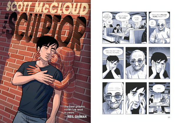
The characters annoyed me a lot because the protaganist was kind of a melodramatic narcissist who embodies the pathetic bleeding heart ill-die-for-my-art artist trope, and the love interest was one of those irritating in your face girls who makes her emotional instability everyone elses problem. These are people who would irritate me incessently in real life so it's a little challenging to conect with the in the story.
The Stan Lee-esque grim reaper guy was pretty solid though, but I guess death has to be a humbled and omniscient character.
The pacing and panelling was faultless, it was smooth to read and basically impossible to put down, even though I kind of hated everyone in it and felt unwillingly obliged to care about what was happening, which I think must speak wonders for the quality of the actual visual structuring of the narrative and arrangement and aesthetic content of the imagery.
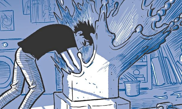
The drawings are very textbook drawings, they are exactly how the things should look, which works for the purpose of clearly communicating a complex narrative but probably works better for the purpose of his instructional comics. They were perfect representations of the things they were representing, but visually that doesn't interest me much.
Also it was clearly all digital and thus felt a bit cold and blunt, which again is fine in an instructional book but I think it put yet another barrier between me and my enjoyment of the story. Especially in parts of the blue shading where you can see the blunt rounded edge of the basic brush on Photoshop.
So basically it was good, kinda, but I don't think I actually liked it.
It was too right
Like a comic book made from a formula of how to make a comic book.
I guess technically correct and ideal things are never as interesting or exciting as they seem theyd be.


No comments:
Post a Comment