i am expensive to exist
at least now i have a vague idea of what i should be aiming for both now and in five years
i dont tend to look at finances from this big picture perspective because its scary but its definitely useful to help me not go bankrupt and starve
I figured the biggest competition for our idea would be the Nobrow magazine as it's already successful and has a similar anthology premise.
Strengths
High production values stemming from a life long interest in print and investment into the quality. It's made to be a desirable object for peoples coffee tables and book collections.
Quality of content from an accumulated network of skilled practitioners.
Choice of limited palette in complimentary colours
Weaknesses
Expensive. Granted for the production values it's not unreasonably priced but at £15 each they're hardly the most affordable magazine on the market
All the work they support follows a house style and they are particularly biased towards work of the same aesthetic. Also the contributions mostly stem from the same insular community of illustrators which disallows newer talents to be considered in the same way.
Opportunities
They don't exhibit talent from new illustrators who need a place to start in publishing as they have such high standards for their submissions
As far as I'm aware they don't make an annual issue of the best of the magazine, probably because they don't produce enough of them in the year to do so.
Threats
It relies on people having disposable income so if the country entered a dire state of economic depression there would be no place for well crafted high priced illustration anthologies. But that could be said of a lot of the discipline I suppose
Who are we
A group of practitioners publishing the work of lesser known artists in quarterly journals.
We aim to create exposure for unpublished or under sung illustrators by distributing the work they contribute.
We will publish an annual collection of our favourite entries throughout the year which will be accompanied by release event for the contributors and other associates from the area.
Dependant on success we will enlist the help of more established practitioners to contribute work or curate an issue.
The work will be un-named so it can be appreciated for it's strength rather than its fame, or lack thereof, but basic contact details such as websites will be included in the back of the journal. Further details can be obtained through us to set up collaborations and we will work as an agency for the people who's work we publish.
Our main aims are to bring exposure to new artists and produce a high quality but affordable illustrative journal.
I did not do well with this module. From start to finish my main problems were poor time usage and planning. It meant I was delayed finishing my author research and subsequently the ideas and development stage was a month behind. Also in November I spent two to three weeks working solidly on Thoughtbubble for the Responsive module which I had also previously neglected so I got quite behind then. Since that I have been constantly trying to catch up with things I didn't do at the time which is incredibly stressful and exhausting. I hereby vow to not do this again.
Despite all my many failures during this project, I'm not entirely dissatisfied with the outcome. My print designs I ended up being quite pleased with after they went through multiple redesigning phases and I put a lot of work into the animation which I really enjoyed making. So overall the projects went badly, but they could have gone worse.
Visual Journal
I liked this element of the module because I work a lot in sketchbooks but often I struggle to keep them focused and coherent, so having to make my sketchbook a more presentable object meant I reigned in my planning and drawing processes and as a result my plans were clearer and much easier for me to use in the production stages.
In the beginning of the module I enjoyed experimenting with collage and loser more ethereal media and themes. I wasn't content with the motifs I chose because at the time I hadn't finished reading the book I focused on so I couldn't pick well related motifs. Despite this I think I developed some useful new processes I can use in future projects, like manipulating images with the photocopier to make textures and using different kinds of line in my drawings.
After these tasks I mostly used the visual journals functionally for planning prints and making storyboards. Perhaps the most useful work I did in the journal was the dictionary of Alan Moore's movements and mannerisms which I continued to refer to even when making the final animations.
Moving Image
This was my favourite brief as I've always wanted to have a real go at animation as I am a lifelong appreciator of cartoons. I really enjoyed the hand drawn task because the process was very theraputic and involving. The product wasn't as succesful as I'd hoped because of the sloppy nature of the drawings so when I reprised this idea I decided to move onto the cintiq and draw each frame digitally. This was infinitely more simple because you can play the animation back at any time and see how its progressing so I'm glad I chose to use this method. Making the final animations was a very long process as I drew each frame out as a seperate layer on photoshop and assembled them into a gifs and finally a video. I think the timeline feature in photoshop has a lot of potential I'd like to explore because it's simple and quick to use but still maintains a good level of quality. I even ended up making gifs for fun I enjoyed it so much. A very valuable newly acquired and developed skill.
As much as I like the plan black line on white part of me wishes I'd made the frames more detailed with a colour or some kind of embellishment. At the time I began producing them this would have taken far too long for me to complete in time so this is something to consider for the future. Although when I remembered contextual references we were shown using only black lines I became more fond of my decision.
I was quite pleased with myself that I managed to think well in terms of making plausible movement. I think this is a result of my working with comics and my constant absorption of animation and cartoons and the skills I've developed doing this will surely go on to help me in making comics and hopefully animation in future. Often I used reference from peoples animation tests on youtube and real-life reference courtesy of my very patient friends. I think I will start attending life drawing again though because as much as I am pleased with the movements I created there is a lot to be developed with regards to my interpretation of accurate anatomy.
I would love to do an animation project again except next time I will put as much consideration into the aesthetic as I do into the movement, and I want to continue to develop my skills by exploring other programs like After Effects and Dragonframe, which I made minimal use of following the inductions.
Printed Pictures
I've learnt from this brief that screen print is not really for me. I attempted it again and again and still I ended up with substandard final prints. I don't think it particularly adds anything to my work, but perhaps it would if I'd managed to complete the prints to a higher standard.
It was difficult altering my image production process to make it suitable for screen print because I had to think about factors I wouldn't usually consider, like how I will minimise the amount of inks and screens I need and how I can make areas of different tone. I think in my final designs I did this quite well because they looked much more suitable for print than my earlier designs but it didn't seem to translate well in the end because of all the problems I have detailed before.
I chose to use bitmap dots in my positives which I think its a great way to make y images translate to printing because I struggle to work without shading and tone. This did cause problems however in the printing process because the dots were very small and often wouldn't expose properly or wouldn't let enough ink through leading to my prints being patchy and pale. Next time I may try a different approach to bitmapping, perhaps darker or smaller dots.
Printing became much easier when I switched to the manual printing beds because it removed the problems of me being to weak to move the various heavy parts of the large printing bed. Also I found it oddly easier to align my prints without the vacuum because the paper is easier to move.
I'm not sure if I'll try screenprint again. Probably sometime in the future but not any time soon, at least not gladly.
Next time I will
-Blog regularly, if not daily
- Decide on a final plan much earlier
-Do the research and complete it much earlier, before the development process
- Allow more time for production
I really love cartoons and I watch them every day and always have done. This being a brief about animation it seems more apt than ever to talk uninhibitedly about cartoons.
I love the simpsons and think it's the greatest show ever made, i make no secret of this. On the DVD commentary of the box sets are animatic commentary videos where the animators and other personnel draw on the screen while episodes or animatic storyboards play. They're really great because the animators dissect the show but from their thought processes, they discuss the composition and lines of motion and character models and animation mistakes and all sorts of exciting things like that. Also it's great to watch the commentaries on seasons 1 and 2 compared with that on the most recent seasons because of how much the process has changed and subsequently the results have changed.
a great post from a terrible website
http://www.buzzfeed.com/patricksmith/9-beautiful-hand-drawn-animations-from-disney-films#.ae41Vayjq
nobody gets fluid movement like disney
John lasseter moment
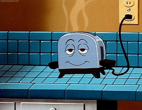
Brave little toaster, the first feature length animation he worked on and one of my favourite animated movies. combines traditional and cgi, one of first to use backgrounds
subsequently everything he touched turned to gold, mostly pixar
coincidentally ex-pixar colleague joe ranft also worked on brave little toaster
i have a theory about joe ranft, that he was a most integral part of pixar.
he died in a car crash in 2004
pixars releases pre 2004 are the ones I consider to be the best, classic and untouchable, toy story, bugs life, monsters inc, finding nemo, the incredibles
then came cars, which I consider to be the turning point in pixar quality, as from here it went steadily downhill with movies that are still excellent but not the same as the pre-cars films, eg. ratatouille, cars 2, brave, monsters university, wall-e (up is the exception)
joe ranft died during the prediction of cars which is the point where I personally see a dramatic change in the output of pixar, a cut off point
thus I think Joe Ranft was pivotally important to the 'pixar magic' of the first releases
this is of course speculation based on little to no facts but it's just a thought
I've spent quite a lot of hours watching golden age cartoons on youtube, mostly silly symphonies and other disney shorts, looney tunes, betty boo, flip the frog and other such old timey stuff
it's nice to watch and know there were none of the digital shortcuts available that we use to draw and animate now and the whole process was different giving it completely different aesthetics, also watching for the shortcuts they could take like reusing frames and movements and repeating backgrounds and camera movements.
South parks pilot episode was made entirely from cut out paper. The process proved too time consuming and for the other episodes various programmes were devised to emulate the cut out paper aesthetic but I think the craft behind the show is often ignored in favour of its controversial subject matter. I'd like to try the cut out paper method, it lends itself more to graphic shapes though so I would have to change my way of drawing
Terry gilliam, using drawn elements combined with found imagery, condenses workload? unites visual opposites with garish colours, humour through movement, movements are silly and simple because they are made of one of un-manipulatable cut outs. Must also try this, collage animation
Levni Yilmaz has hundreds of these videos, using a marker to draw onto the tracing paper canvas. it's all drawn from the back so he has learnt the skill of drawing and writing backward for this process. effective result from minimal animation and embellishment, commentary glazes over images and animation is all the image being drawn, simple but engaging
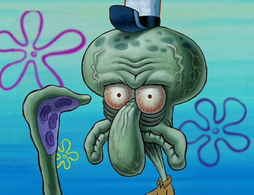
Spongebob I think is a modern animation classic, if there is such a term, started as cell animation but moved to digital ink and paint early on. Kept the previous aesthetic and has clear links to ren and stimpy, close ups mostly. Great example of absurdity and modern humour and writing combined with classic animation principles and movements.
massive impact of sound effects in time with visual stimulus. When first episodes came back from animators John K was horribly dissatisfied with the animation quality so the sound effects were exaggerated greatly to compensate for this.
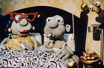
Ren and stimpy is horrifying and sordid without actually doing anything wrong. Just the grotesqueness of the characters and the outlandish overstretched movements, combined with the campy innocent 50's themes makes something captivatingly playful and sinister the splotched backgrounds were said to represent the holes in reality or the vision of a person in a deep state of dementia also the pioneers of the grotesque cartoon closeup, made famous more recently by spongebob and its the first and perhaps only cartoon show to have fake adverts made to be part of the show, most notably log and sugar frosted milk
nightmare before christmas - Stop motion, balance of macabre and charm and child appropriate
Naive, charming, high production value, possible by large team of creatives, Jesse Monynihan, Ghost Shrimp etc. power of imagined worlds and invented logic
Half way through every episode a chasm opens and everything goes to hell. Hense the name regular show. They use textured watercolour backgrounds layered with the animated elements. Hand made touch humanises sleek digital animation
The visual quality of rick and morty seems to constantly flit between crude and simplistic and intensley comlex and beautiful.
Adam Elliot - Mary and Max, Harvey Krumpet. claymation, studies into a the life of characters, stories based entirely around character design, infinitely charming and moving.
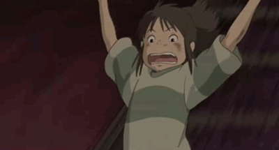
what could i possibly say of Studio Ghibli that hasn't been said already
beautiful, hand drawn, investment of labour, pastel faded colour schemes, mythology and legend and rich cultural history gives stories and visuals depth. totally impeccable
made with toys, stop motion, using existing toys as puppets, manipulated slightly with cut out mouths and such, shows the process of animation doesn't require the lengthy drawing process, can be used as a medium to produce an idea, not just an extension of drawing. show is made up of multiple shorts put together. means less effort than planning storyboarding and animating full episode length sequences, instead fast fired jokes and snappy erratic puppet animation
There's an endless amount of other cartoons I could prattle on about but it's definitely bedtime now
Still not sure what level of relevance this post even has
this advert eleanor showed in a briefing initially influenced me to work in simple black lines on white as I saw it could be just about the movements rather than a complicated aesthetic. wanted to focus on making convincing and dynamic character movements