Monday 1 December 2014

Thoughtbubble


Thoughtbubble is very different from the other side of the table. Having attended for the past three years I thought I had a good idea of what it would be like but it was more of a gigantic learning curve.

Stuff I've learnt:

Preparation is key - I was not prepared in advance and this made the run up to Thoughtbubble INCREDIBLY stressful. I did all-nighters and everything. Next time I will start doing things from the minute I book my table, but along side other work, rather than sacrificing college work to finish the things I planned to do for this. I didn't get to do everything I wanted to, like adding to my old comics and finishing my new ones to a good standard. I didn't allow enough time to print and produce and were it not for Rowena's assistance none of my comics would be trimmed, folded or stapled. 

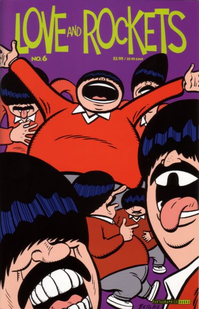
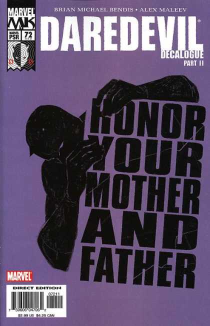
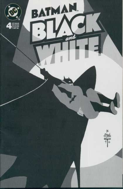
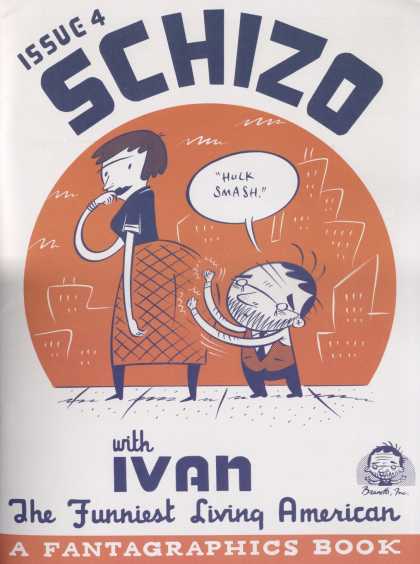
Front covers are important - I have a tendency to put a lot of effort into the contents of a comic but by the time I get to do the cover I've usually ran out of time and I just slap something together at the last minute. This hasn't been a problem before as I've been giving them out for free but when I want people to buy my comics all they can see at a quick glance is the cover, there's no way of them knowing if they'd enjoy the story  

Fan Art - I realise I have undervalued fan art. As much as I still think it's a cop out and that people should create their own characters and worlds to make work based on, I now realise there is a market for it at Thoughtbubble and in terms of profit it is very valuable. Who's to say there's more integrity in writing stories anyway.

Quality - Looking at other people making similar work, I noted that their things were of a lot higher physical quality. They were printed better, in colour or at least the covers had colour, and more thought had clearly gone into the things they were selling. Overall other peoples things appeared a lot less rushed than mine did.

Table Setup - The more professional looking tables had more care put into the setup of their tables, they didn't just cram all of their things onto the available space like I did. There's decorative elements to consider, also more professional looking stands and nicer ideas for displaying work like hanging prints on a washing line on the front of the table.

Rude Browsers - An irritating amount of people would approach the table, read the entirety of one of my comics, put it down, smile and walk away. I don't know why they thought that was okay, especially when the thing they read was usually only a pound, and I have no idea how to prevent this next year other than calling them out on it, which would probably just create a bad atmosphere. This requires further consideration.

'Networking' - The most enjoyable part of the whole thing was just talking to other creators. I noticed it was massively different to talking to them as an exhibitor than as an visitor as our gold wristbands automatically established a level of equality and solidarity, leading to more in depth conversations based on an assumed level of knowledge. I was on the end of our table so I sat next to Dilraj Mann who is a lovely person and we bonded over many things from creative processes to the idea of a world populated entirely by hardcore nerds.

Off Life

Off Life's comic journals relate to our proposed business plan in that they collect work from artsists lesser known and famed. In the next issue they intend to publish entirely comics from previously unpublished artists which is almost exactly our premise. Theres a good variety of work and a high level of skill and quality across them all.


Thursday 27 November 2014

nostalgia and progress exhibition

we nipped over to see this exhibition at leeds uni
loved it, all the work was great and there was edward ardizonnes drawings there which i haven't seen since foundation so that was nice
its a nice change to see galleries of illustration, i get fed up with galleries of fine art
very nice very nice


Thursday 20 November 2014

Comic Book Covers

So as a starting point for designing the covers for some of Alan Moore's comics I'm looking at covers of other comic books.
Please excuse this toilet roll of a blog post

Palookaville - Seth 


Starman - Tony Harris 1994

Silver Surfer - Moebius 
(do more research on)


Spectacular Spider-Man #101 cover - John Byrne


Tantalizing Stories #1 cover by Jim Woodring


The One #1 cover by Rick Veitch


Watchmen - Dave Gibbons


Love & Rockets 82 series, # 33 cover by Jaime Hernandez


 Marvel Comics Presents #77 cover by Barry Windsor Smith


Love and Rockets, 2000 series #6 by Gilbert Hernandez


Uncanny X-Men #167 by Paul Smith


Astro City #1, 1996 series -cover by Alex Ross


Batman: Legends of The Dark Knight #43 cover by P. Craig Russell.


Batman: Legends of the Dark Knight #54 cover by Mike Mignola


Daredevil #230 cover by Dave Mazzuchelli


Doctor Strange #56 by Paul Smith


Doom Patrol #49 by Tom Taggart


Eightball #15 by Dan Clowes


Flinch #5 by Tim Sale


Gangland #1 by Tim Bradstreet


Batman#404 cover by Dave Mazzuchelli


hahahahahahahahaha

Batman #407 cover by Batman#407


Action Comics #810 by Dave Bullock


Chase #6 cover- pencils by J.H. Williams III, inks by Mick Gray, colors by Lee Loughridge


Daredvil #180 pencils by Frank Miller, inks by Klaus Janson


Demo #11 cover -pencils, inks, and colors by by Becky Cloonan


Detective Comics #761 cover by Dave Johnson


The second Daredevil series started in 1998, written by Kevin Smith (of Clerks) and drawn by Marvel editor-in-chief Joe Quesada. The "Decalogue" series ran from issues 71 to 75 and presented different sins written in bold letters on the covers


The Batman: Black and White mini series was a showcase of beloved comic artists rendering Batman without any colors. This minimalist cover is by Alex Toth. Other covers in this series were by comic book legends Jim Lee, Frank Miller, and Barry Windsor-Smith. 


Ivan Brunetti


Sunday 16 November 2014

PPP Task 3

Nobrow
Nobrow's magazines collect together the work of different artists, some lesser known and vaguely anonymously in that the names are after the content, so is quite similar to our proposal. It fits under the private sector as it's sold for profit, under that it fits into the creative industries and wholesale and retail as its a product to be purchased, then publishing and to an extent graphic design and advertising (for the illustrators inside, 'showcasing'). 
I think they're successful in these sectors as they've achieved an admirable level of acclaim and a made a ton of money. Also the artists featured in the book get a invaluable exposure to a massive audience


Kramers Ergot
A more experimental regular anthology of comics, featuring artists of varying levels of establishment, starting off with lesser known and developing to much bigger artists, especially in the 7th. These books also would be part of the private sector in the creative industries and specifically publishing and graphic design and partially advertising, as I suppose all examples relating to our proposition will be. This too is successful in the business,  perhaps not as financially so as Nobrow, I don't know, but in levels of critical acclaim in this category its definitely as successful, if not more so. 

Drawings by specifically girls on a theme. This fits in the same sectors as it makes money for the creators personally, belongs to the creative industries and is also publishing, graphic design and advertising. It's a less successful example of these kind of books mostly as the illustrators involved are of a lower profile but it does the things it intends to so it has at least a degree of success. 


McSweeneys Quarterly Concern
Literary journal with collections of writing and illustration in which the format and style changes all the time. This fits in the same categories despite it containing much more literature than the others, as presumably that aspect would still fit under publishing. Definitely a successful example as its been going since 1998 making 4 issues a year. In reading the wikipedia article I found the name was chosen as Dave Eggers recieved post addressed to Timothy McSweeney as a child and thought it held an air of mystery, which is oddly how I've always felt about the company for reasons I can't explain, mostly likely ignorance. 

This example differs slightly as its more focused on discussion of illustration rather than exposure as our hypothetical idea would, but it holds the similarity of exhibiting artists both well known and new. Despite it being more of a magazine style publication than some of the other examples it still fits in the same sectors as it makes money for the business and is a product that can be sold. It fits into the creative industries but with a more equal weighting between the three categories, publishing, graphic design and advertising.

I think these examples all followed a very similar pattern for the reason that our idea is already similar to an established format of publication which doesn't often deviate far from its conventions.