we nipped over to see this exhibition at leeds uni
loved it, all the work was great and there was edward ardizonnes drawings there which i haven't seen since foundation so that was nice
its a nice change to see galleries of illustration, i get fed up with galleries of fine art
very nice very nice
Thursday, 27 November 2014
Thursday, 20 November 2014
Comic Book Covers
So as a starting point for designing the covers for some of Alan Moore's comics I'm looking at covers of other comic books.
Please excuse this toilet roll of a blog post
Please excuse this toilet roll of a blog post
Palookaville - Seth
Starman - Tony Harris 1994
Silver Surfer - Moebius
(do more research on)
Spectacular Spider-Man #101 cover - John Byrne
Tantalizing Stories #1 cover by Jim Woodring
The One #1 cover by Rick Veitch
Watchmen - Dave Gibbons
Love & Rockets 82 series, # 33 cover by Jaime Hernandez
Marvel Comics Presents #77 cover by Barry Windsor Smith
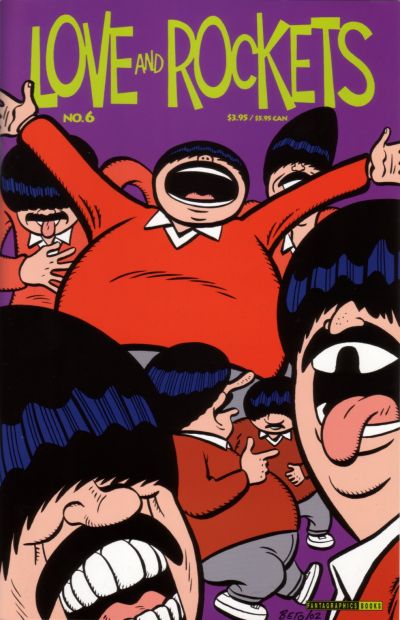
Love and Rockets, 2000 series #6 by Gilbert Hernandez
Uncanny X-Men #167 by Paul Smith
Astro City #1, 1996 series -cover by Alex Ross
Batman: Legends of The Dark Knight #43 cover by P. Craig Russell.
Batman: Legends of the Dark Knight #54 cover by Mike Mignola
Daredevil #230 cover by Dave Mazzuchelli
Doctor Strange #56 by Paul Smith
Doom Patrol #49 by Tom Taggart
Eightball #15 by Dan Clowes
Flinch #5 by Tim Sale
Gangland #1 by Tim Bradstreet
Batman#404 cover by Dave Mazzuchelli
hahahahahahahahaha
Batman #407 cover by Batman#407
Action Comics #810 by Dave Bullock
Chase #6 cover- pencils by J.H. Williams III, inks by Mick Gray, colors by Lee Loughridge
Daredvil #180 pencils by Frank Miller, inks by Klaus Janson
Demo #11 cover -pencils, inks, and colors by by Becky Cloonan
Detective Comics #761 cover by Dave Johnson
The second Daredevil series started in 1998, written by Kevin Smith (of Clerks) and drawn by Marvel editor-in-chief Joe Quesada. The "Decalogue" series ran from issues 71 to 75 and presented different sins written in bold letters on the covers
The Batman: Black and White mini series was a showcase of beloved comic artists rendering Batman without any colors. This minimalist cover is by Alex Toth. Other covers in this series were by comic book legends Jim Lee, Frank Miller, and Barry Windsor-Smith.
Ivan Brunetti
Sunday, 16 November 2014
PPP Task 3
Nobrow
Nobrow's magazines collect together the work of different artists, some lesser known and vaguely anonymously in that the names are after the content, so is quite similar to our proposal. It fits under the private sector as it's sold for profit, under that it fits into the creative industries and wholesale and retail as its a product to be purchased, then publishing and to an extent graphic design and advertising (for the illustrators inside, 'showcasing').
I think they're successful in these sectors as they've achieved an admirable level of acclaim and a made a ton of money. Also the artists featured in the book get a invaluable exposure to a massive audience
Kramers Ergot
A more experimental regular anthology of comics, featuring artists of varying levels of establishment, starting off with lesser known and developing to much bigger artists, especially in the 7th. These books also would be part of the private sector in the creative industries and specifically publishing and graphic design and partially advertising, as I suppose all examples relating to our proposition will be. This too is successful in the business, perhaps not as financially so as Nobrow, I don't know, but in levels of critical acclaim in this category its definitely as successful, if not more so.
Drawings by specifically girls on a theme. This fits in the same sectors as it makes money for the creators personally, belongs to the creative industries and is also publishing, graphic design and advertising. It's a less successful example of these kind of books mostly as the illustrators involved are of a lower profile but it does the things it intends to so it has at least a degree of success.
McSweeneys Quarterly Concern
Literary journal with collections of writing and illustration in which the format and style changes all the time. This fits in the same categories despite it containing much more literature than the others, as presumably that aspect would still fit under publishing. Definitely a successful example as its been going since 1998 making 4 issues a year. In reading the wikipedia article I found the name was chosen as Dave Eggers recieved post addressed to Timothy McSweeney as a child and thought it held an air of mystery, which is oddly how I've always felt about the company for reasons I can't explain, mostly likely ignorance.
This example differs slightly as its more focused on discussion of illustration rather than exposure as our hypothetical idea would, but it holds the similarity of exhibiting artists both well known and new. Despite it being more of a magazine style publication than some of the other examples it still fits in the same sectors as it makes money for the business and is a product that can be sold. It fits into the creative industries but with a more equal weighting between the three categories, publishing, graphic design and advertising.
I think these examples all followed a very similar pattern for the reason that our idea is already similar to an established format of publication which doesn't often deviate far from its conventions.
Wednesday, 5 November 2014
Subscribe to:
Comments (Atom)


